

Comfort starts long before the thermostat
Company formation, a brand with its manual, applications, website and market presence for Good Air Pro, an HVAC company in Palm Bay, Florida.
- Client
- Good Air Pro
- Business type
- HVAC
- Service area
- Branding
- Location
- Palm Bay, Florida
Services delivered
- Company Creation
- Brand Design
- Identity Manual
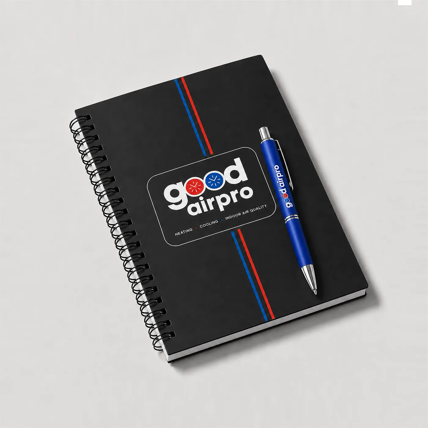
- Brand Applications
- Web Design & Development
- Hosting & Business Email
- Presence in Their Market
- Local SEO
- WhatsApp Support
The challenge
Good Air Pro knew how to do the work: installing, maintaining and repairing air conditioning and heating in Palm Bay and Brevard County. What it didn't have was a company. No paperwork, no name anyone would recognise, no way for a neighbour with a dead system on a Tuesday in August to find them. Word of mouth brought work, but word of mouth doesn't reach the house next door and doesn't let you charge above whoever is improvising.
What we did
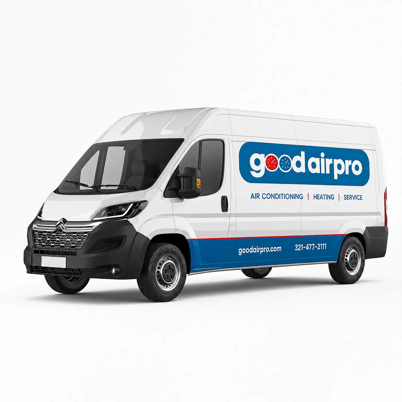
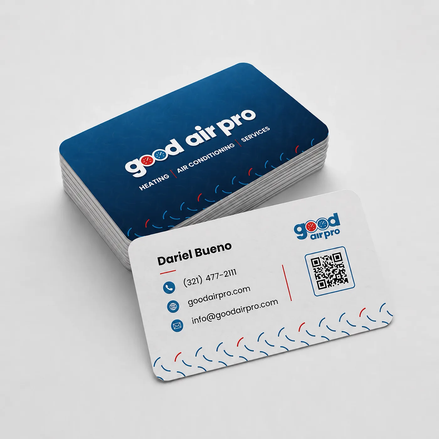
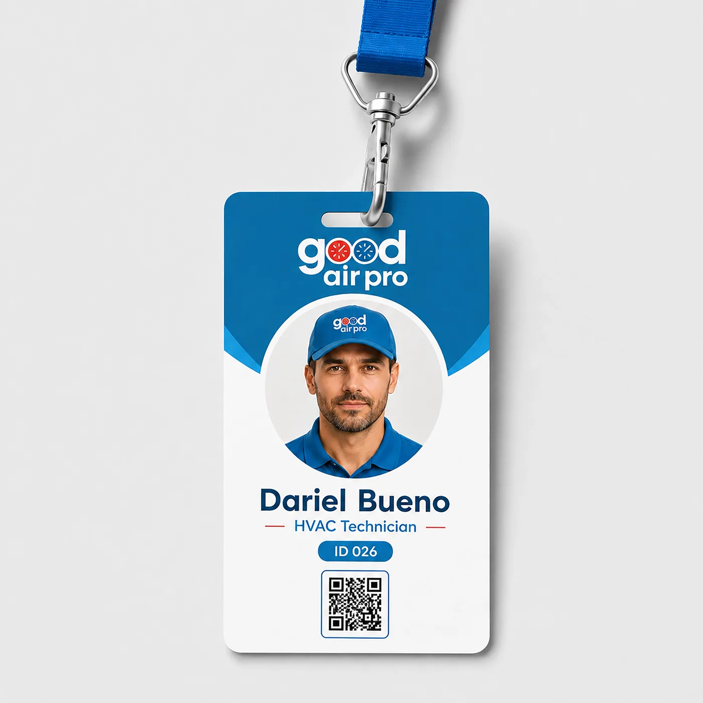
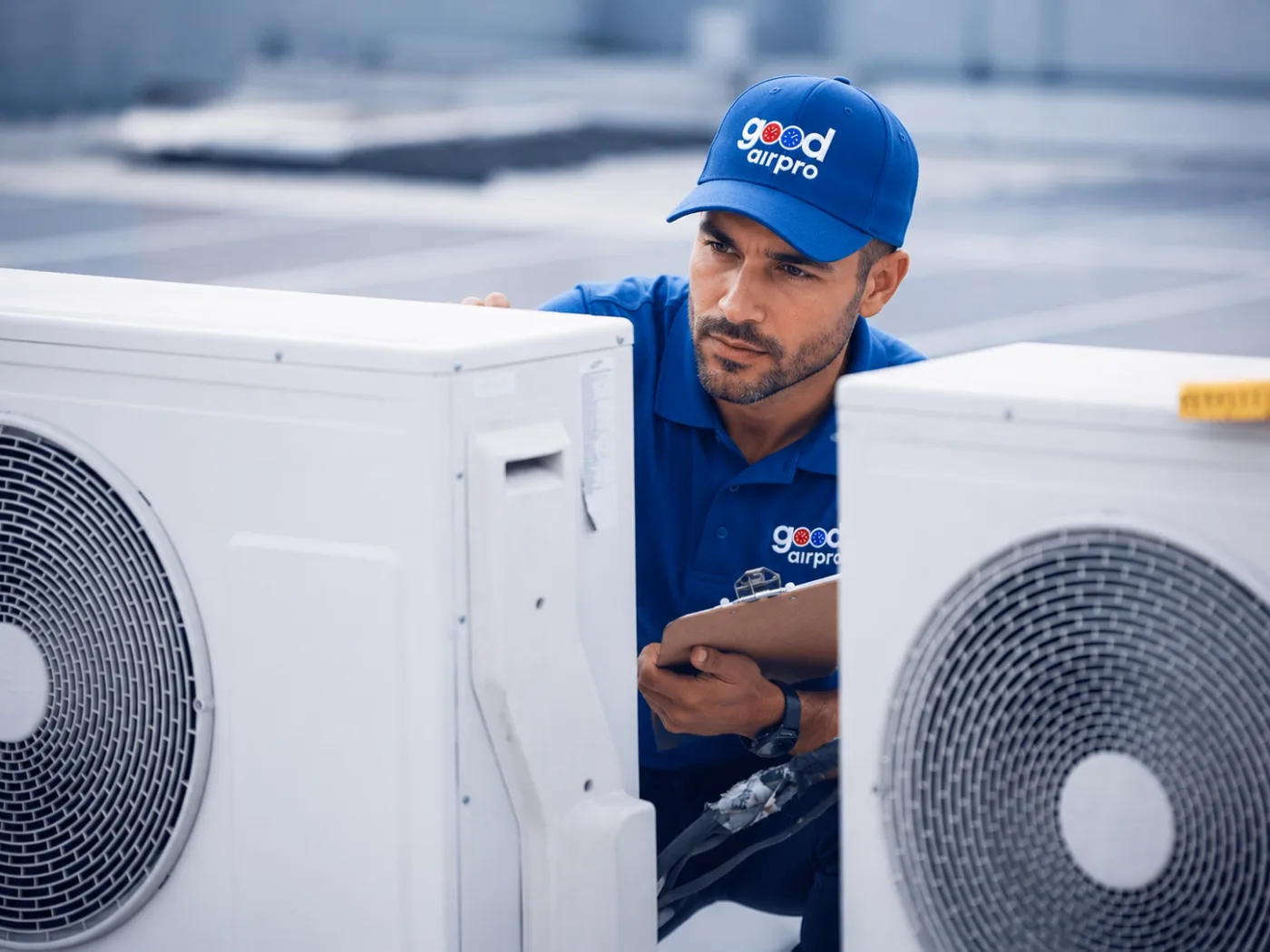
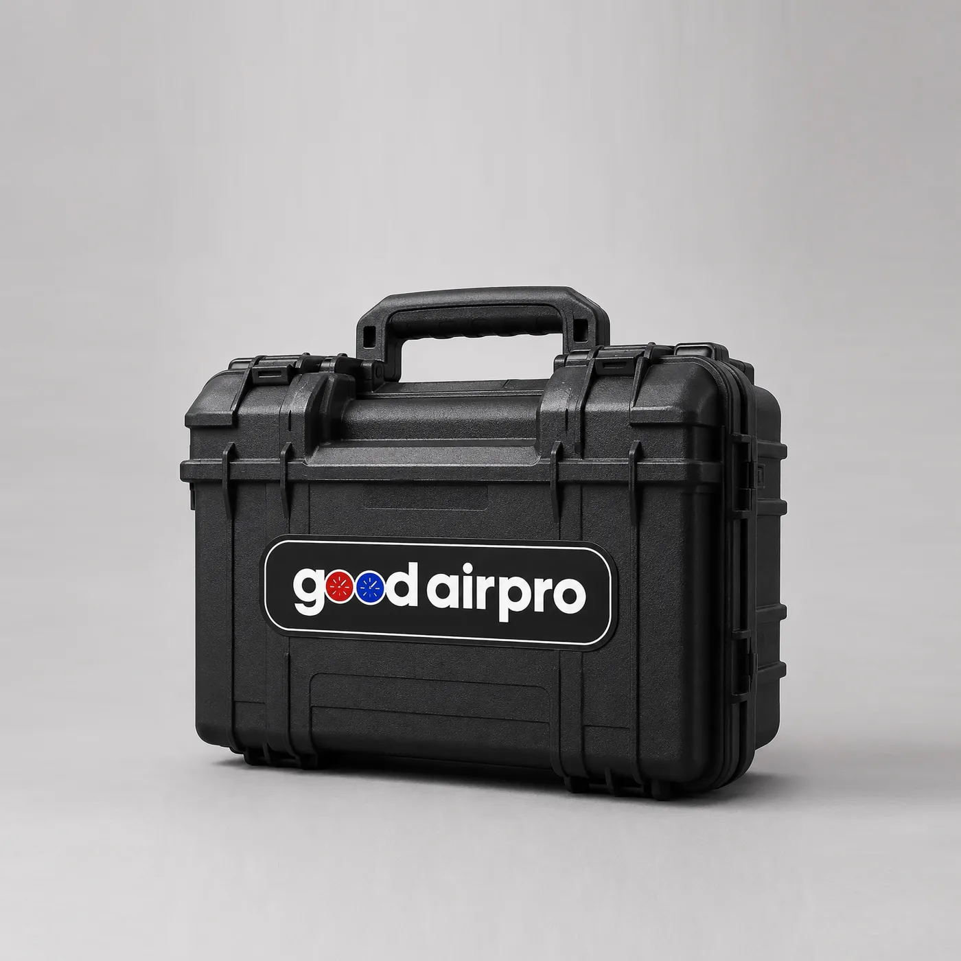
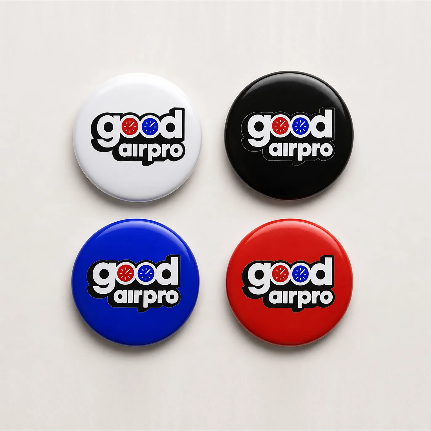
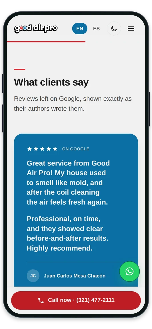
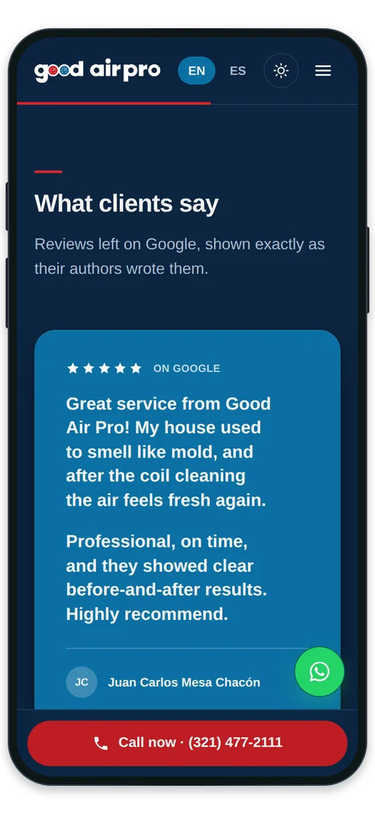
We set up the whole business, in the order it was needed. First, to exist: the company formed and in order. Then, to be recognised — a mark where the two o's of “good” are pressure gauges, with a manual behind it so the van, the polo, the ID badge and the label left stuck on the unit all say the same thing even when different shops print them. And finally, to be found: a website with its own hosting and email, a page per breakdown instead of a list of services, and their presence set up in the market, with the reviews their customers leave also readable on their home page.
The result
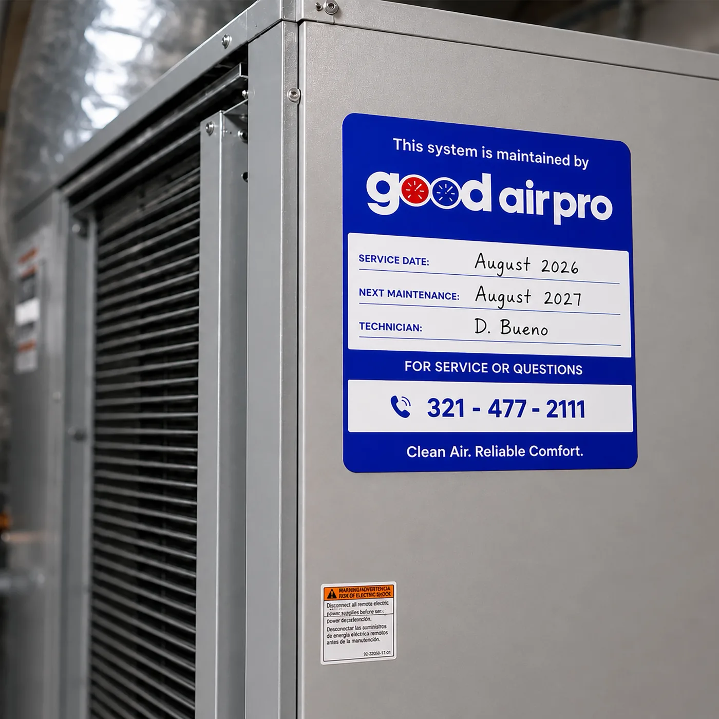
A company that exists on paper and gets recognised on the street. The van works even when parked: every house it enters leaves an ad on that street for the whole day. The label stuck on the unit puts the phone number in front of whoever opens that box next, which might be three years from now. And whoever searches for their breakdown lands on the page for that breakdown, call button one tap away, instead of a generic home page they have to dig through. Underneath all of it there is one rule: nothing was decided by eye. The colors are measured one by one against the accessibility standard —the brand blue didn't make it, so it was darkened until it did— and the site checks itself every time it is touched.
The brand manual
The manual exists so the brand doesn't depend on who applies it: the shop lettering the van, the printer running the cards and whoever builds the website all work from the same document.
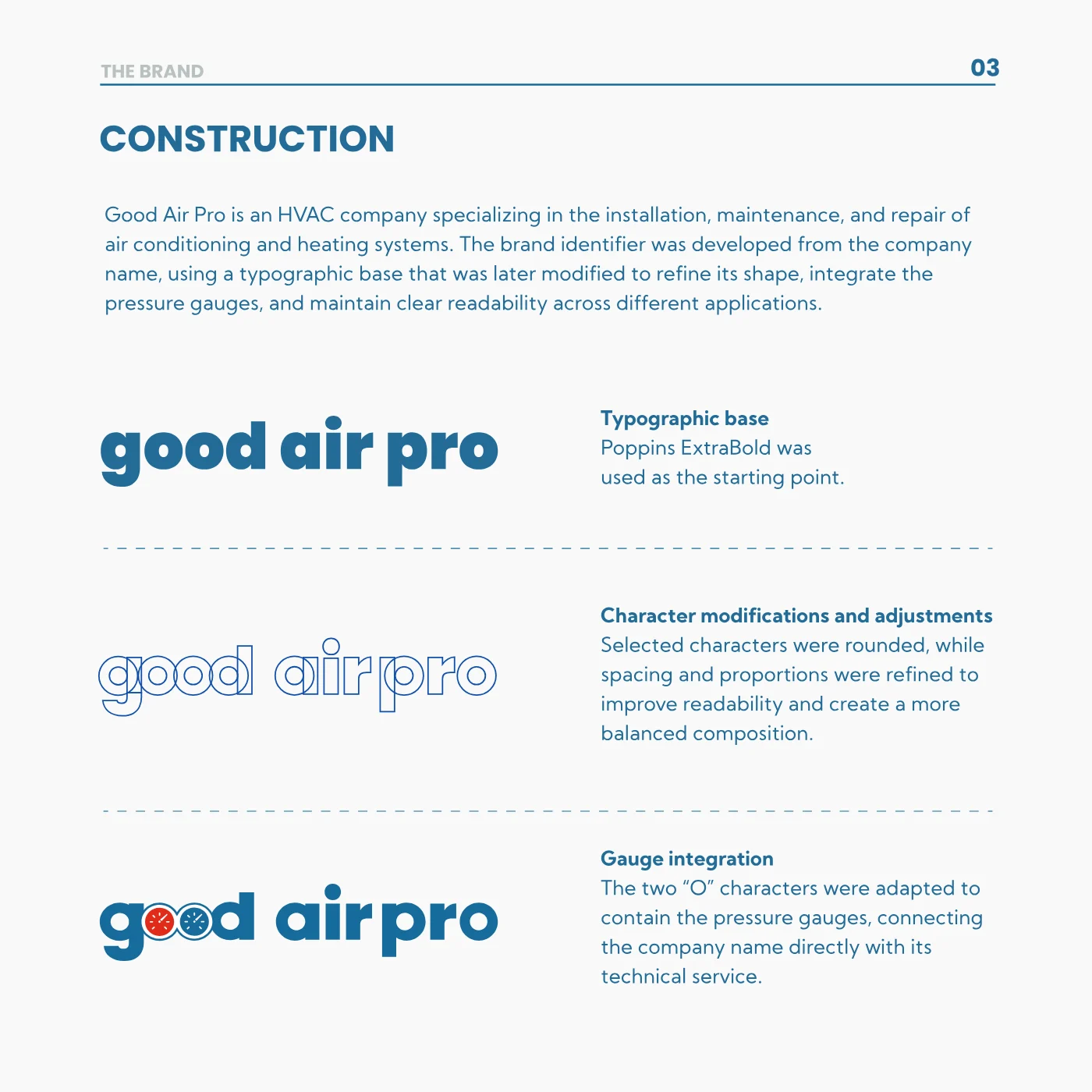
Two pressure gauges inside the name
The logo starts from a typeface and gets reworked until the two o's of “good” are pressure gauges. That way the name says what the company does before anyone reads another word.
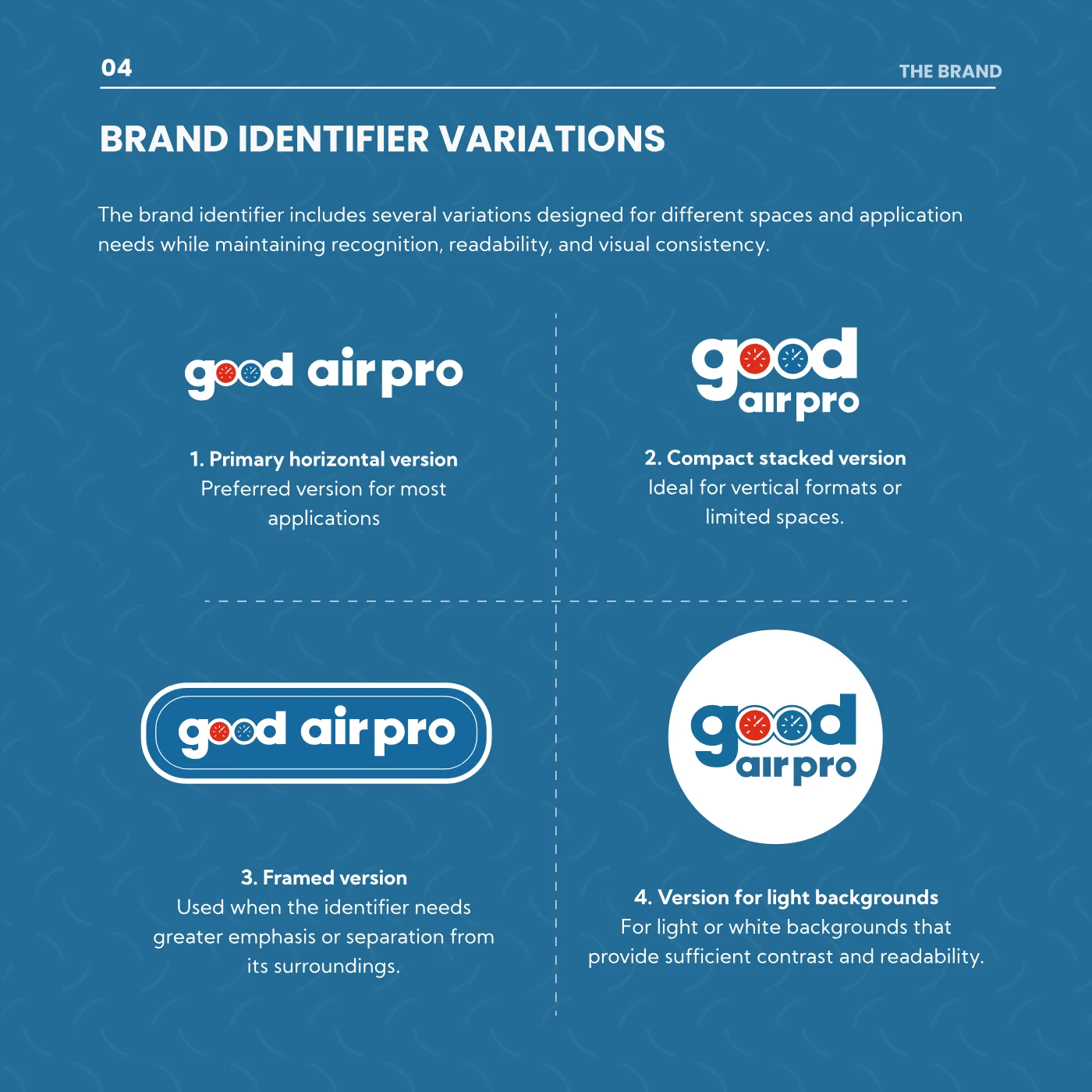
A variant for every place it lands
Seven versions: horizontal for most things, stacked when the space is narrow, framed over photography, white for dark backgrounds, black for one-color printing. Nobody has to improvise the day the logo doesn't fit.
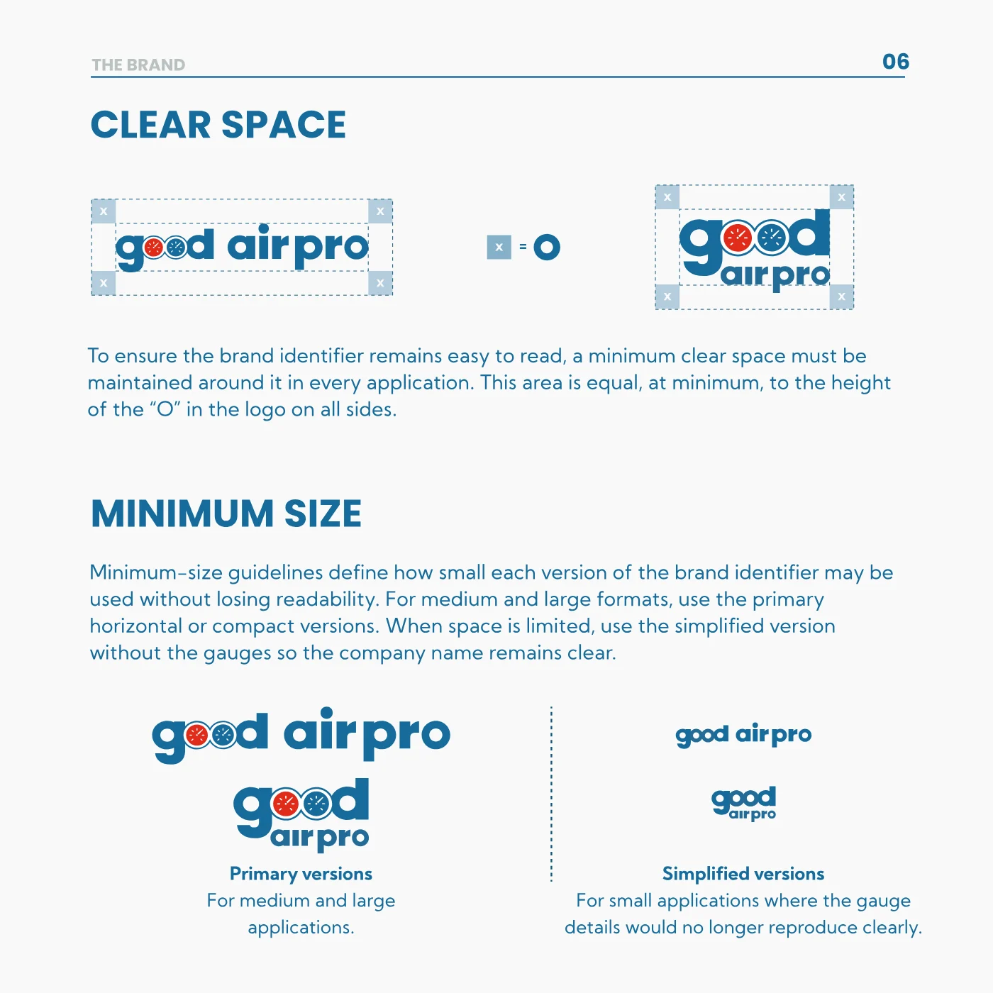
The air around it, and where it gives up
The clear space around the logo is measured with its own “O”, so it comes out the same on a business card and on the side of the van. And when the format gets so small the gauges blur, there's a simplified version instead of an unreadable logo.
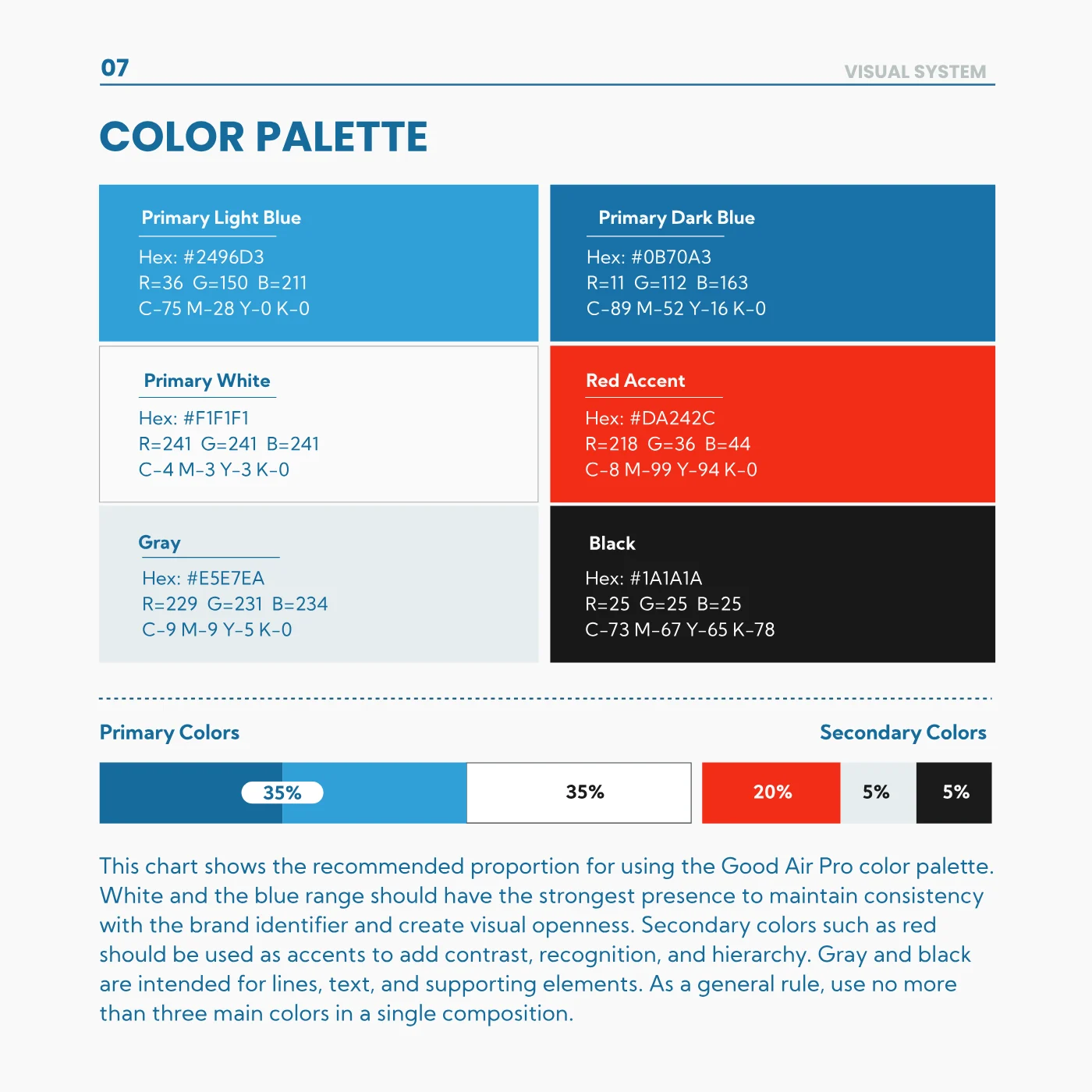
Six colors and the proportion they mix in
Every color ships with its HEX, RGB and CMYK, so the sign shop and the screen arrive at the same blue. And the proportion is fixed —35% blues, 35% white, 20% red— which is what keeps each piece from ending up looking like another company's.
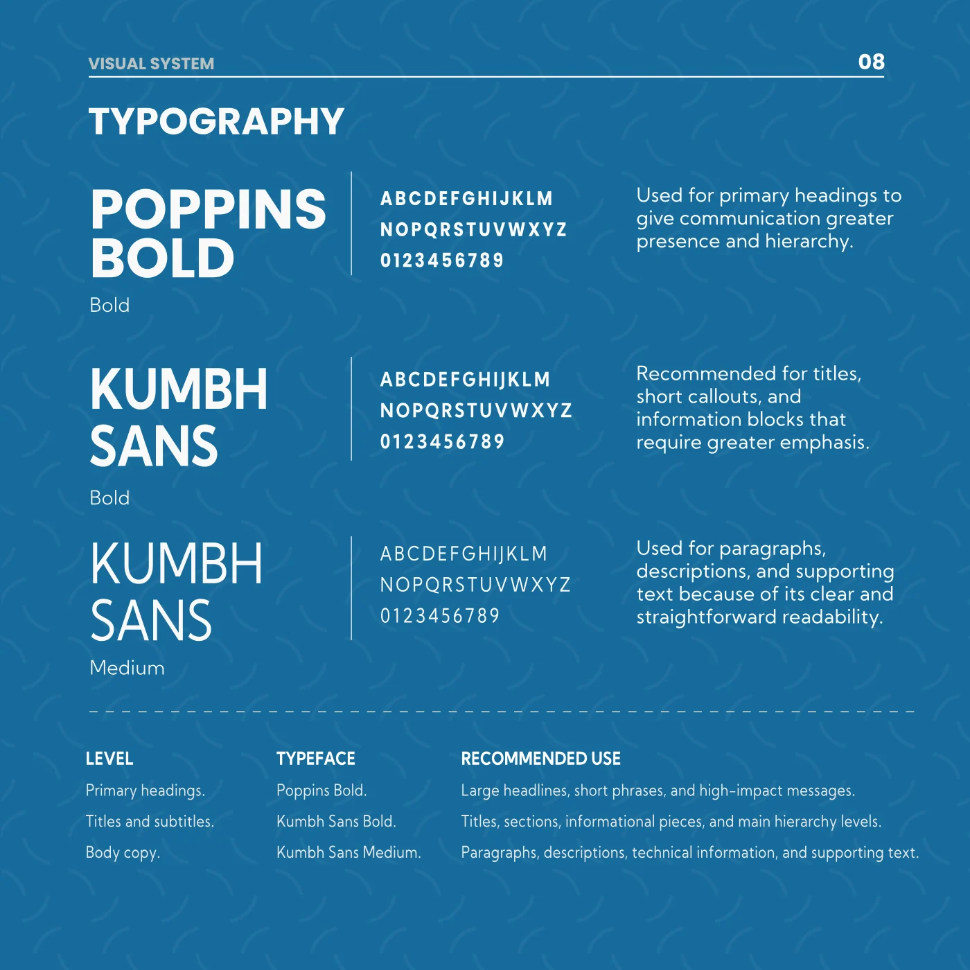
Two typefaces with the work divided up
Poppins for headlines, Kumbh Sans for everything read at length. Which one goes where is written down, so a new supplier doesn't have to ask or pick on their own.
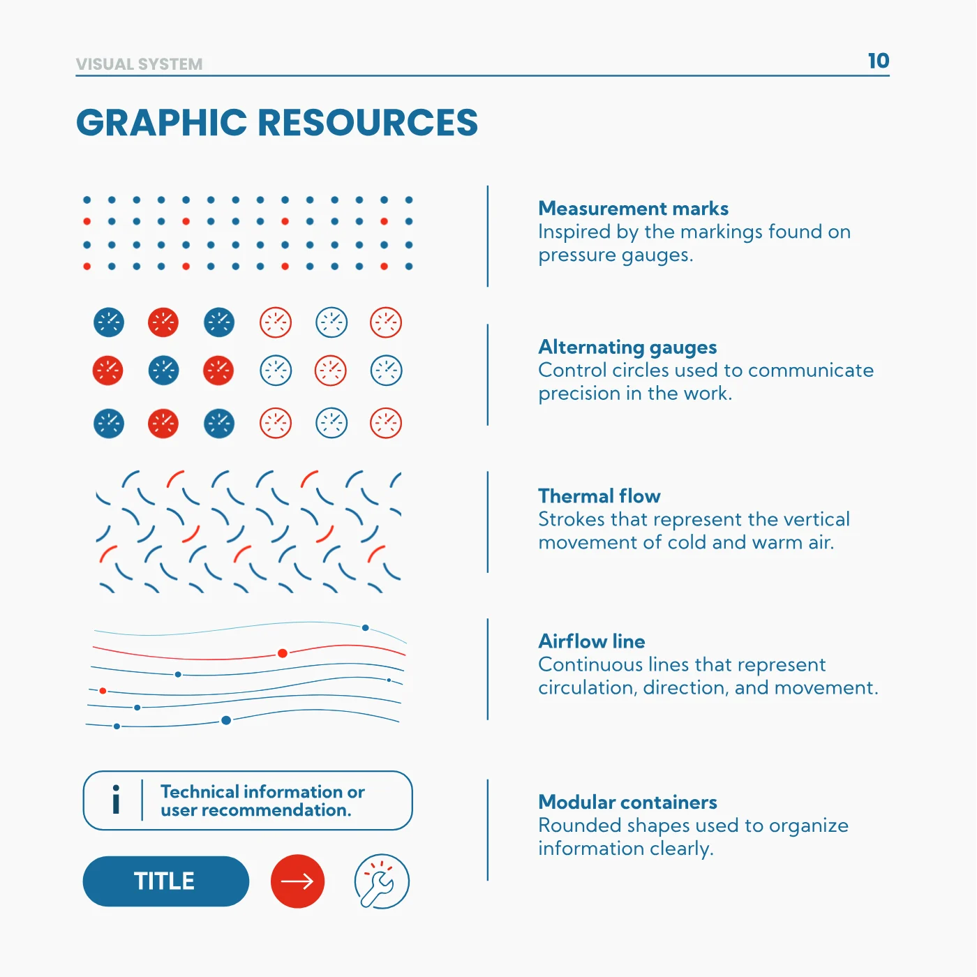
Five resources that grow out of the gauge itself
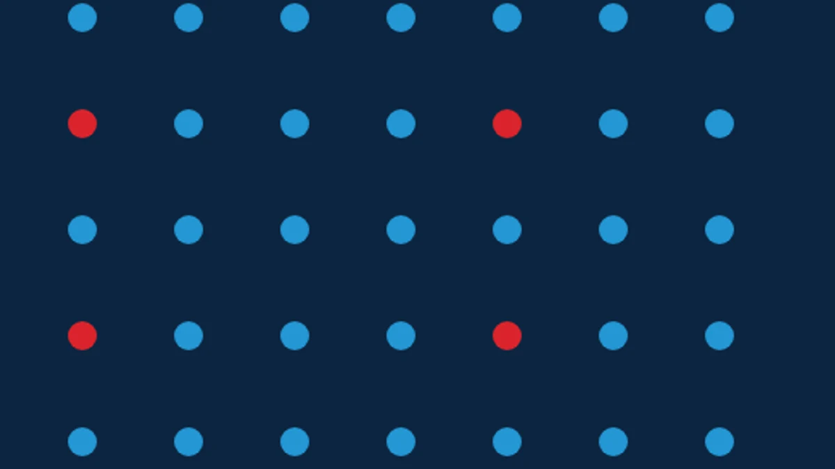
Measurement marks, alternating gauges, strokes of cold and warm air, flow lines and rounded containers. With those you can build a flyer or a whole section of the site without it looking like another brand's.
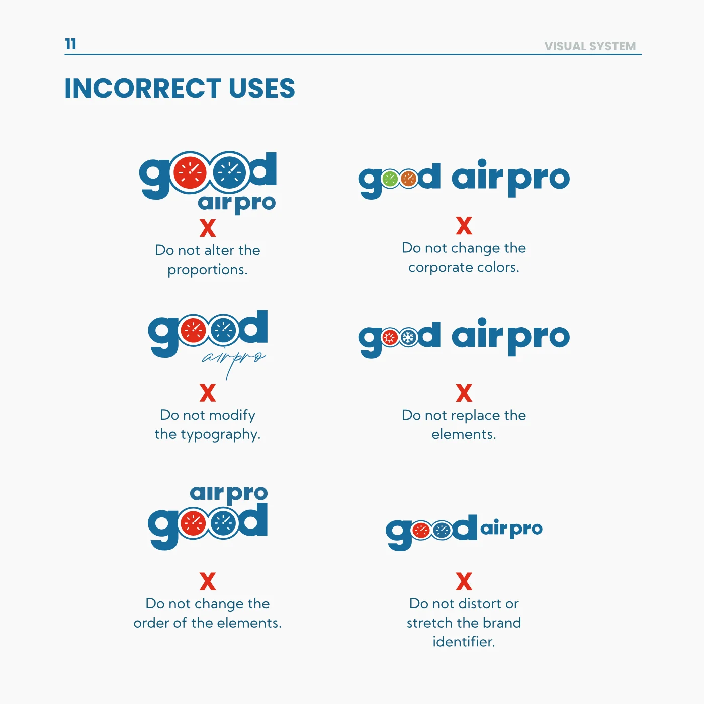
And one plate for what is not done
Six mistakes drawn out: distorting the logo, changing its colors, touching the typography, altering the order of the elements. Drawn rather than described, because that way they're spotted at a glance in the proof a printer sends back.
The project in pictures


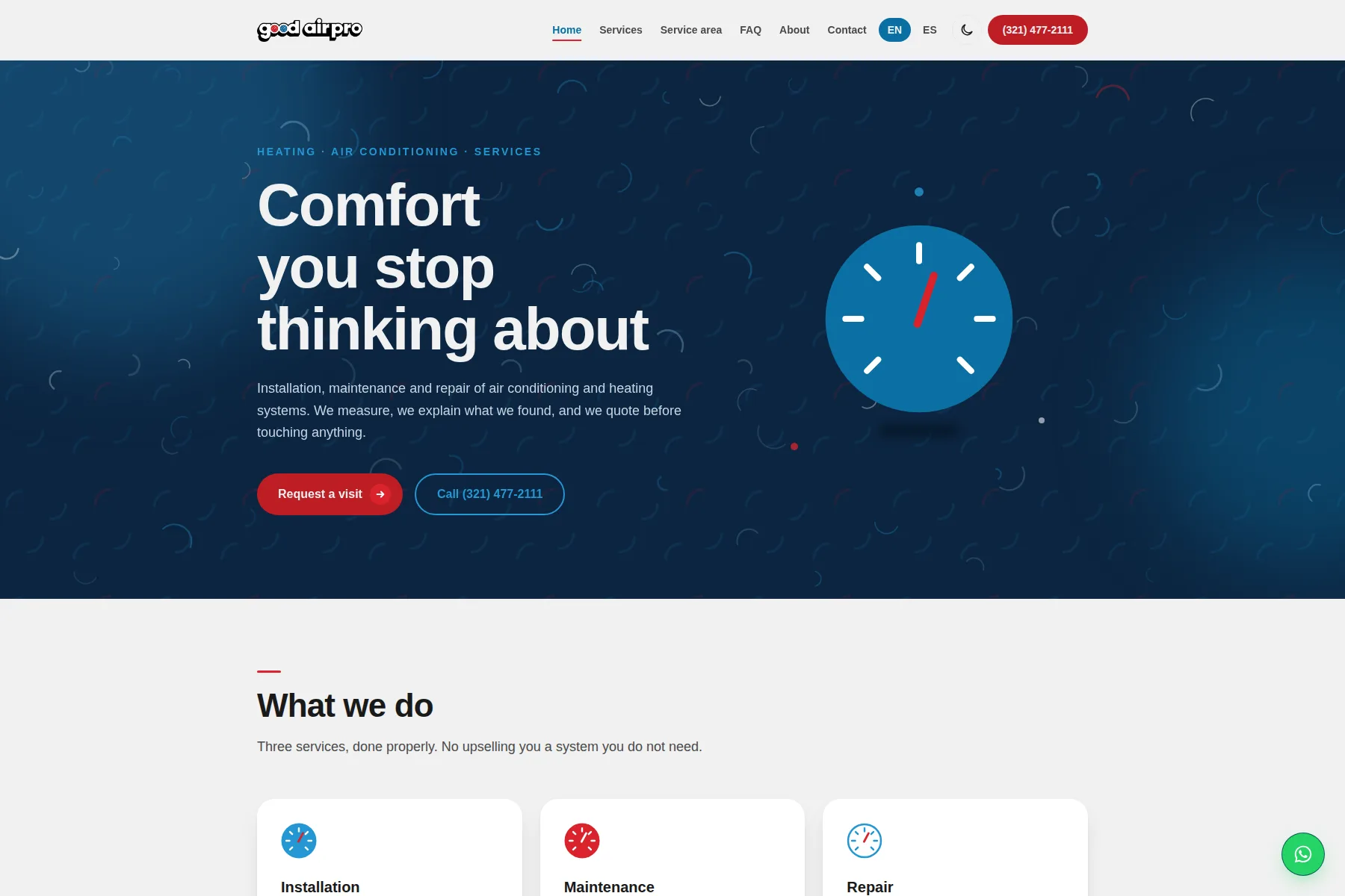
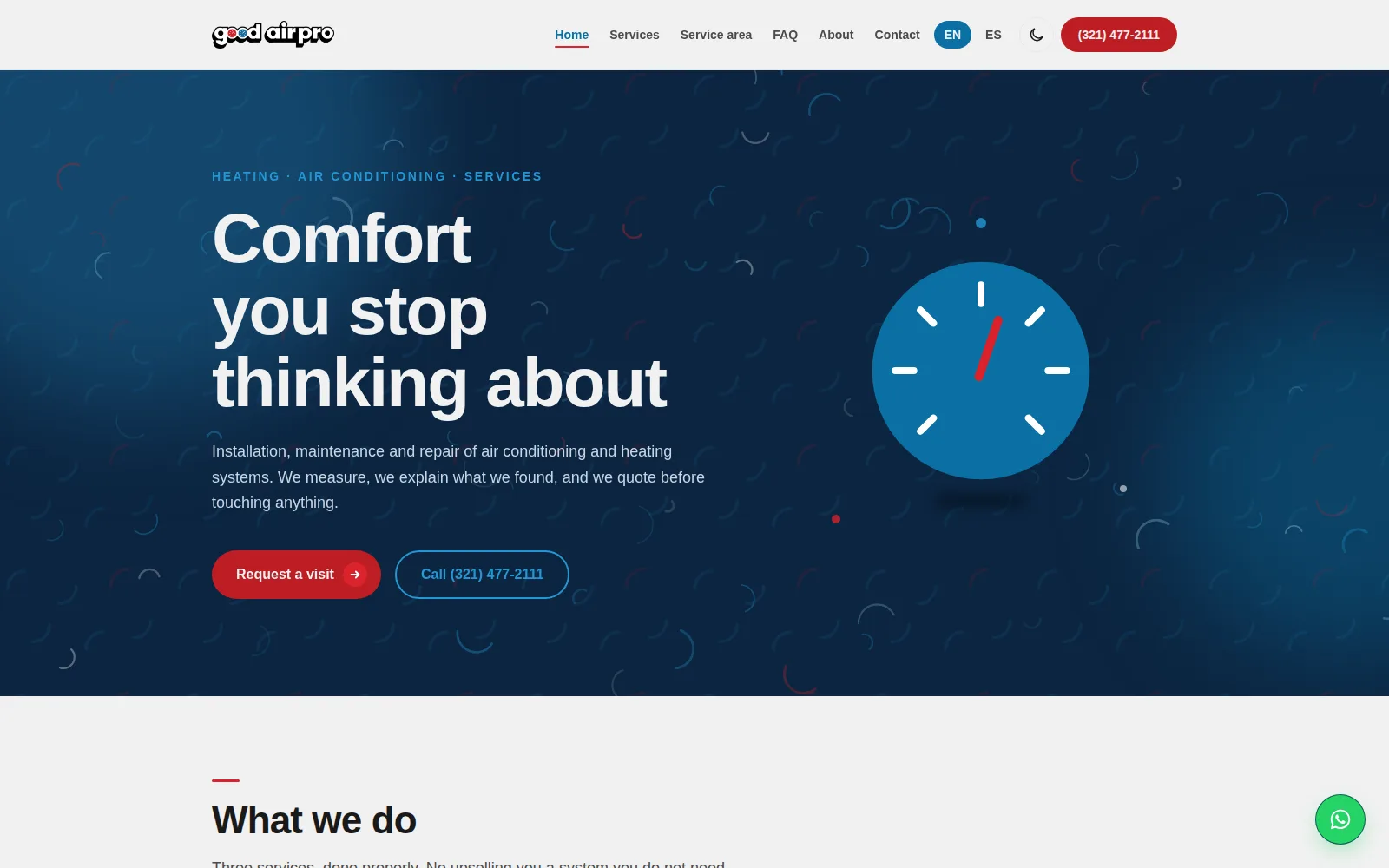
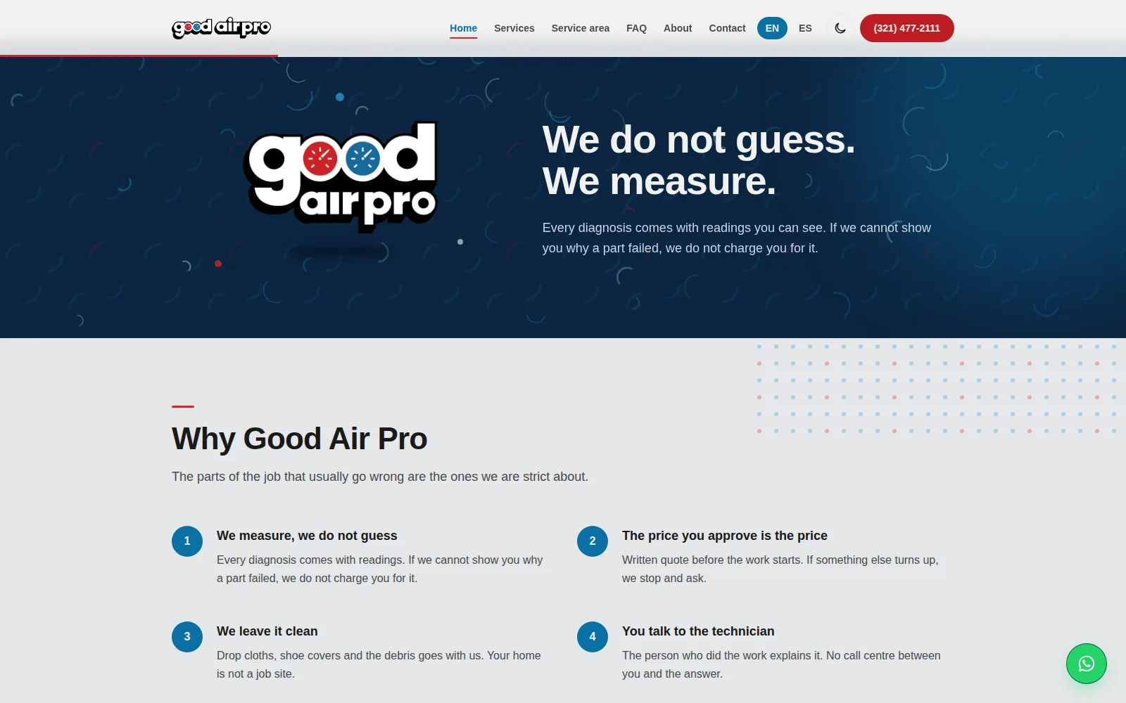
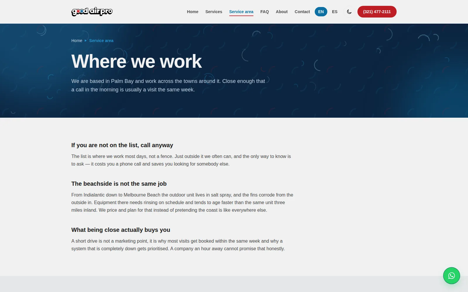
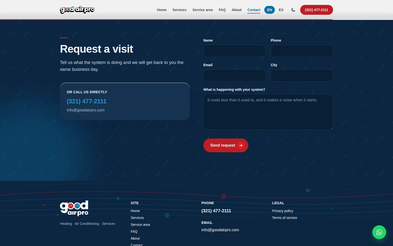
The site, screen by screen
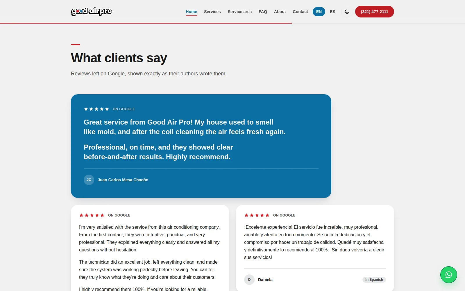
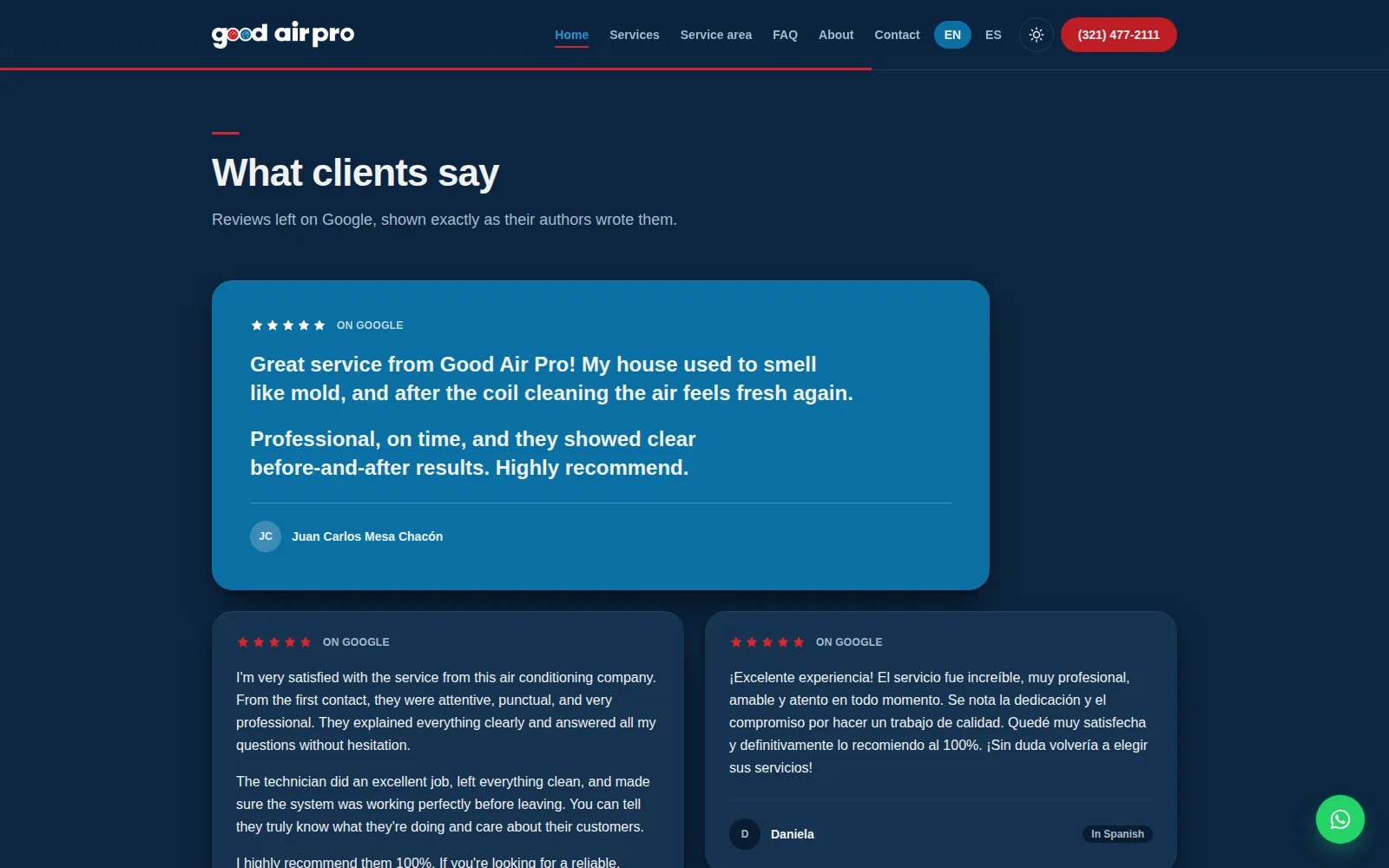
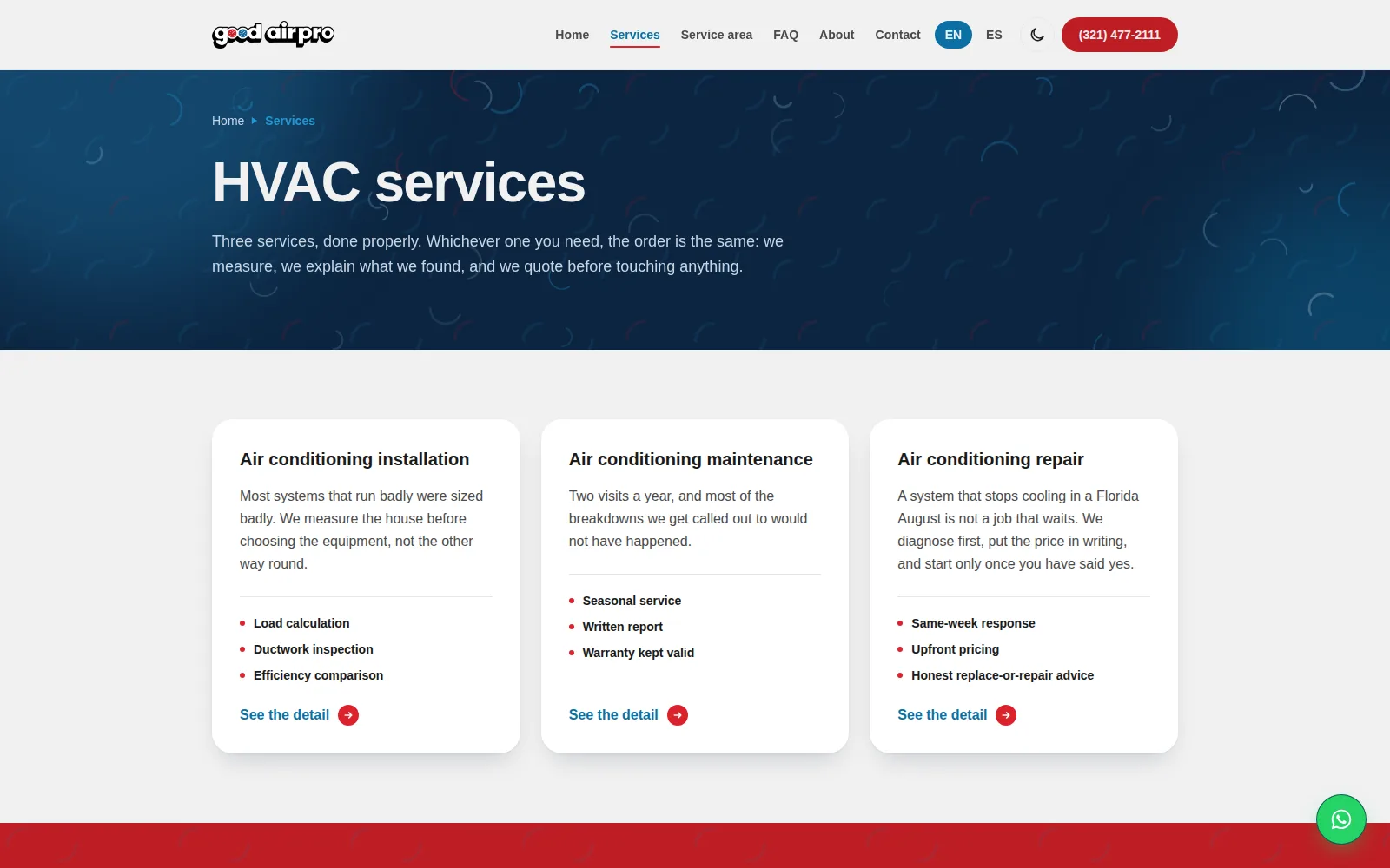
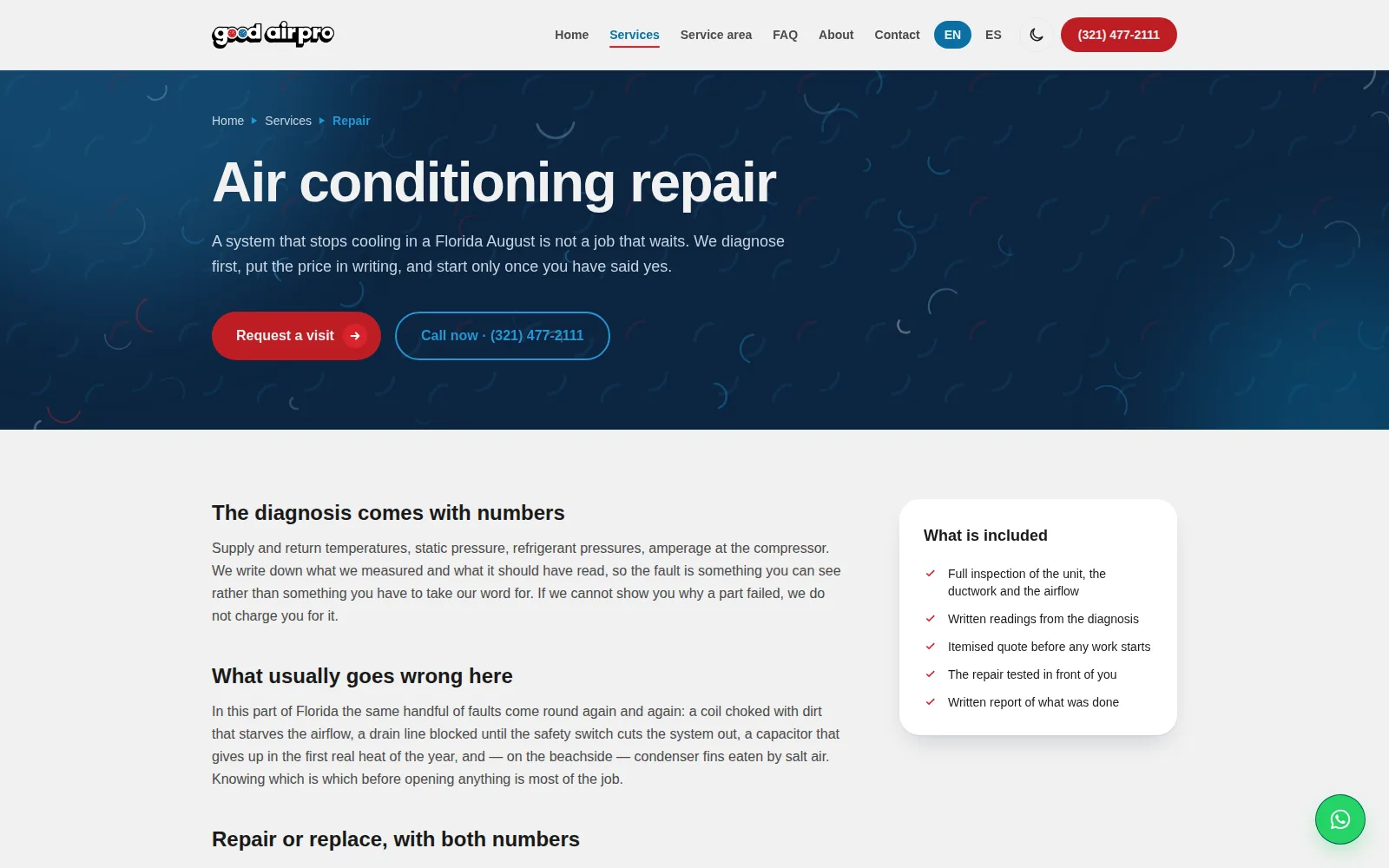
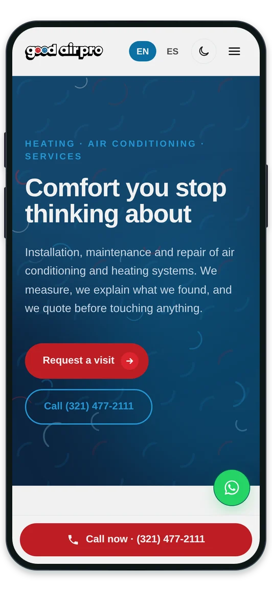
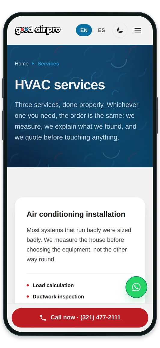
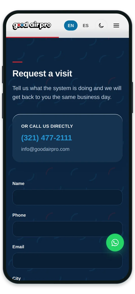
The same site on a phone, in light and dark
The graphic resources, already on the site
On the site they weren't pasted in as images: they are drawn in the code, so they stay sharp on any screen and switch between light and dark on their own.




Ready to start?
Tell us your idea and we'll show you how to make it a real company.
Let's talk about your project