

A notary public who comes to your door
A brand with its manual, applications, website, email, hosting and search visibility for Mobile Notary California, a mobile notary public who comes to the client's home, office or hospital room.
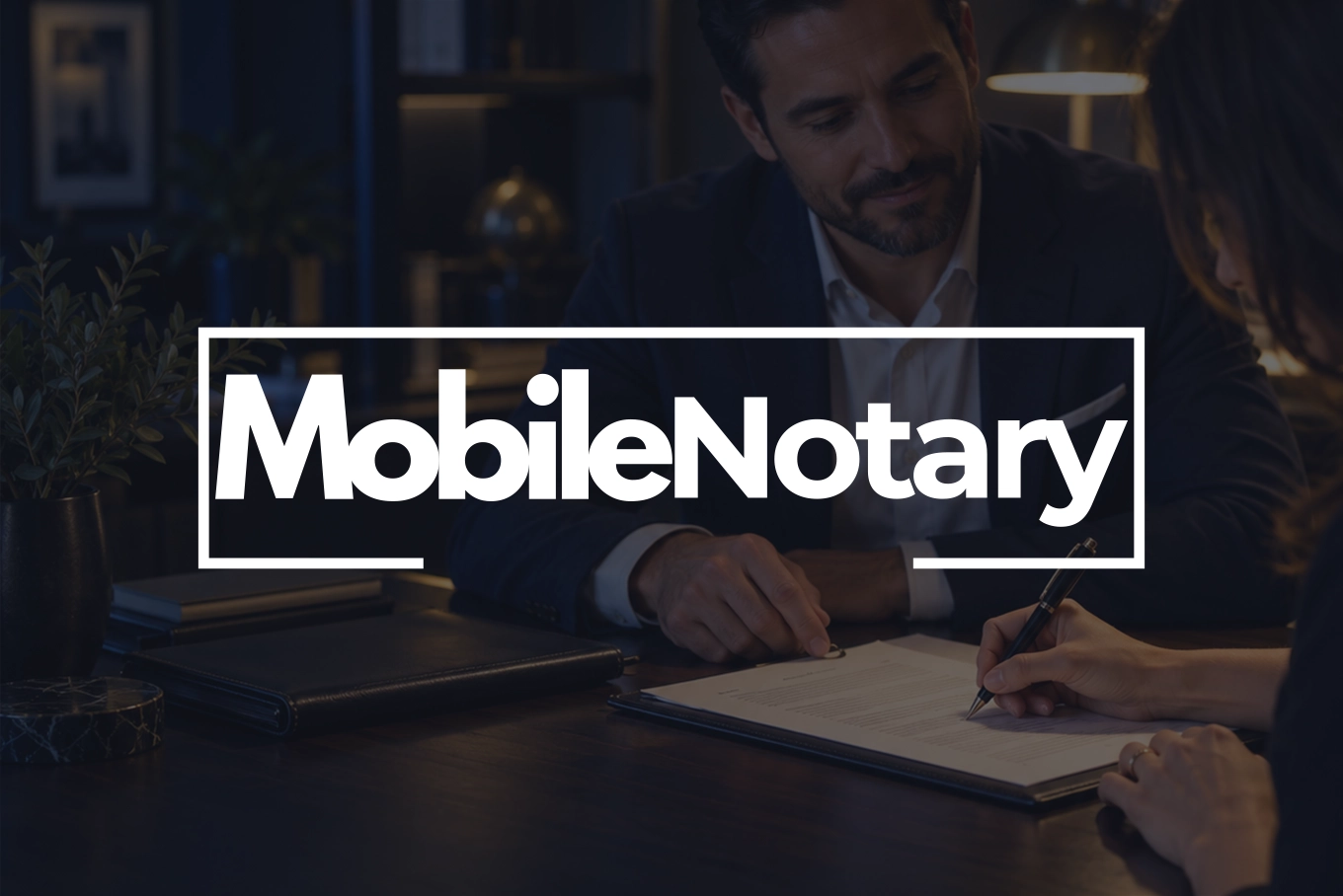
The document on its home page
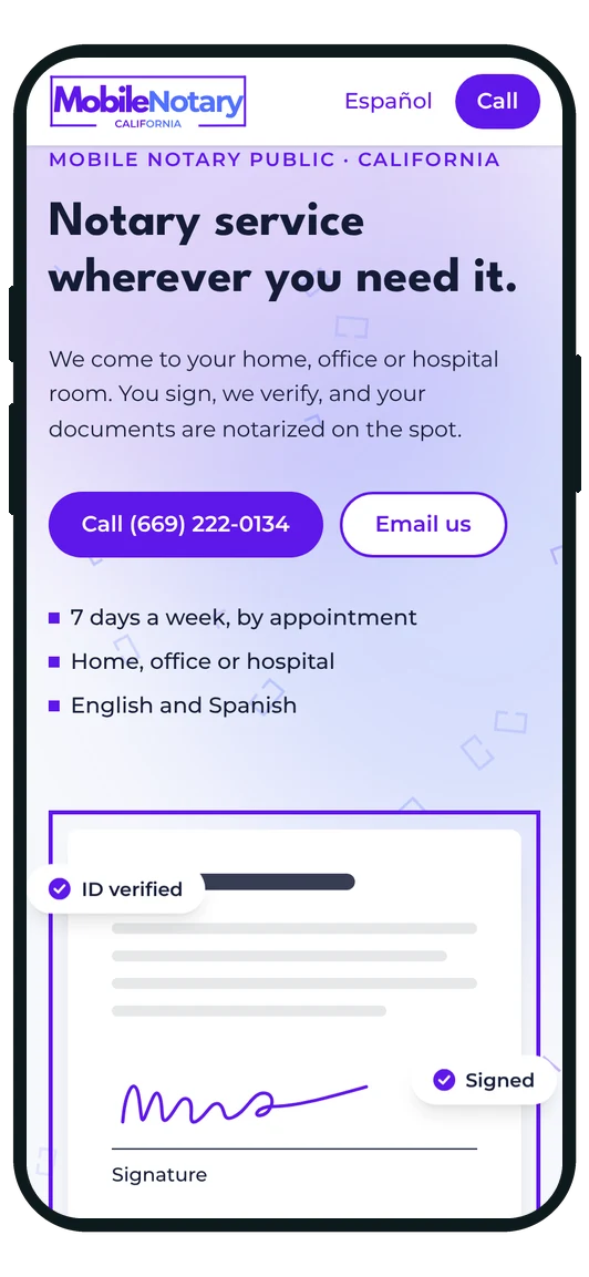
This is the piece from the home page of their site, working: a sheet inside the logo's open frame, with a signature that writes itself and three badges floating around it. It tells the service —verify, sign, notarize— without a word too many.

- Client
- Mobile Notary California
- Business type
- Mobile notary public
- Service area
- Branding
- Location
- San José, California
Services delivered
- Brand Design
- Identity Manual
- Brand Applications
- Web Design & Development
- Hosting & Business Email
- Local SEO
The challenge
A mobile notary sells trust before arriving. Someone opening their door to a stranger with their most important papers needs to see order and precision before calling, not afterwards. Mobile Notary California had the service and lacked what it takes to look the part: without a brand to set it apart, every message and every document would come out different, and anyone searching for a notary near home had no reason to find them.
What we did
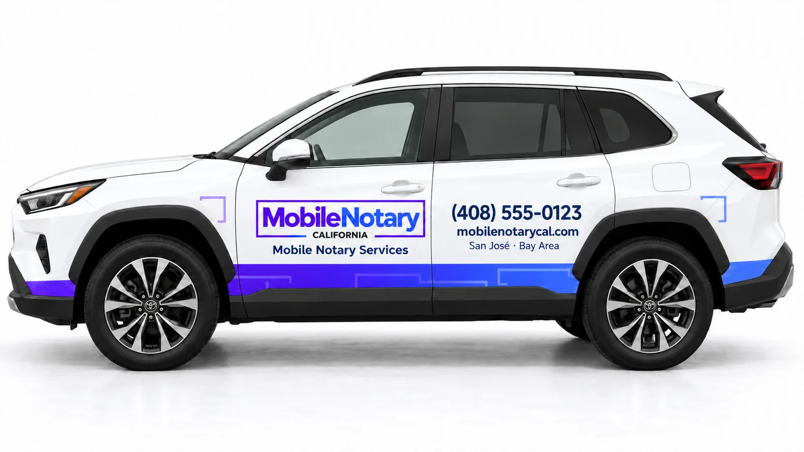
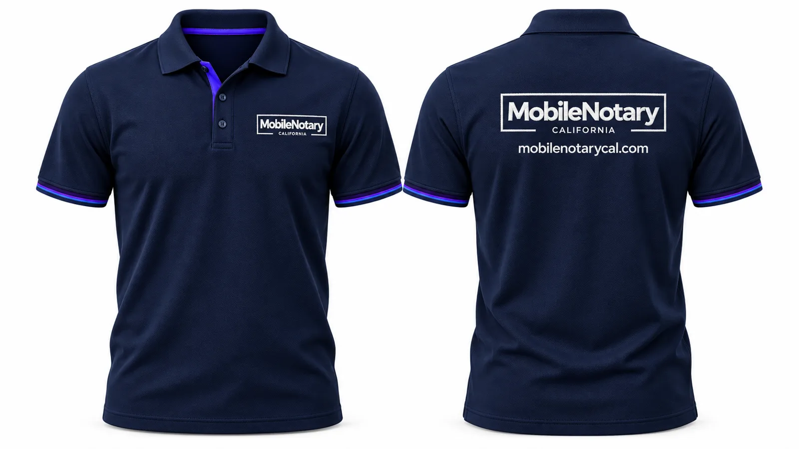
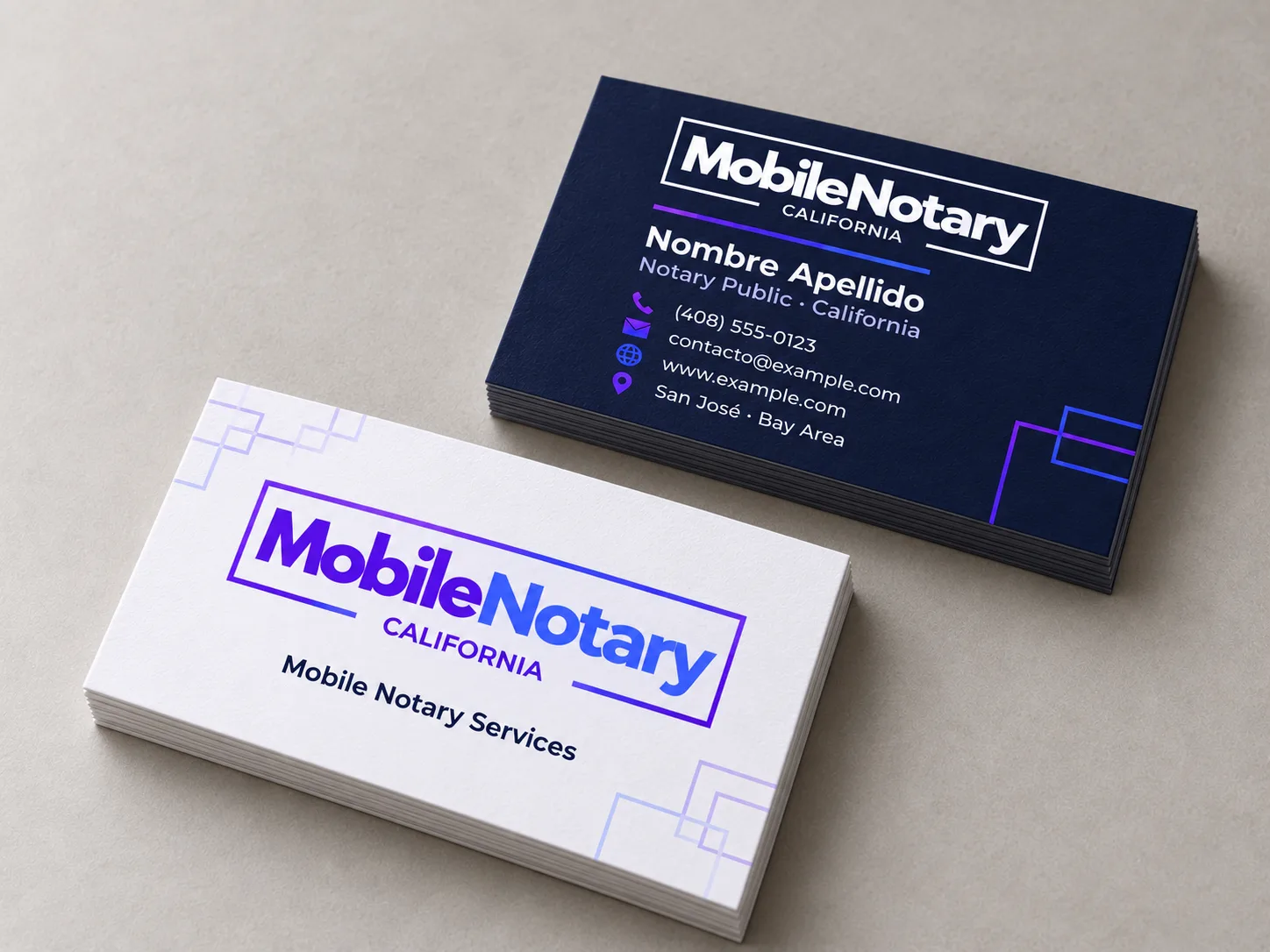
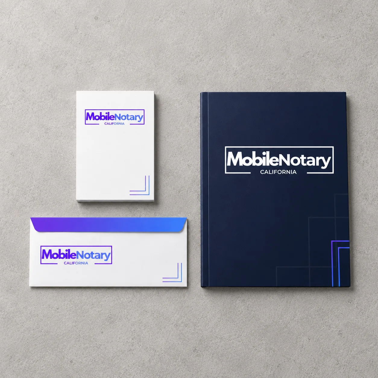
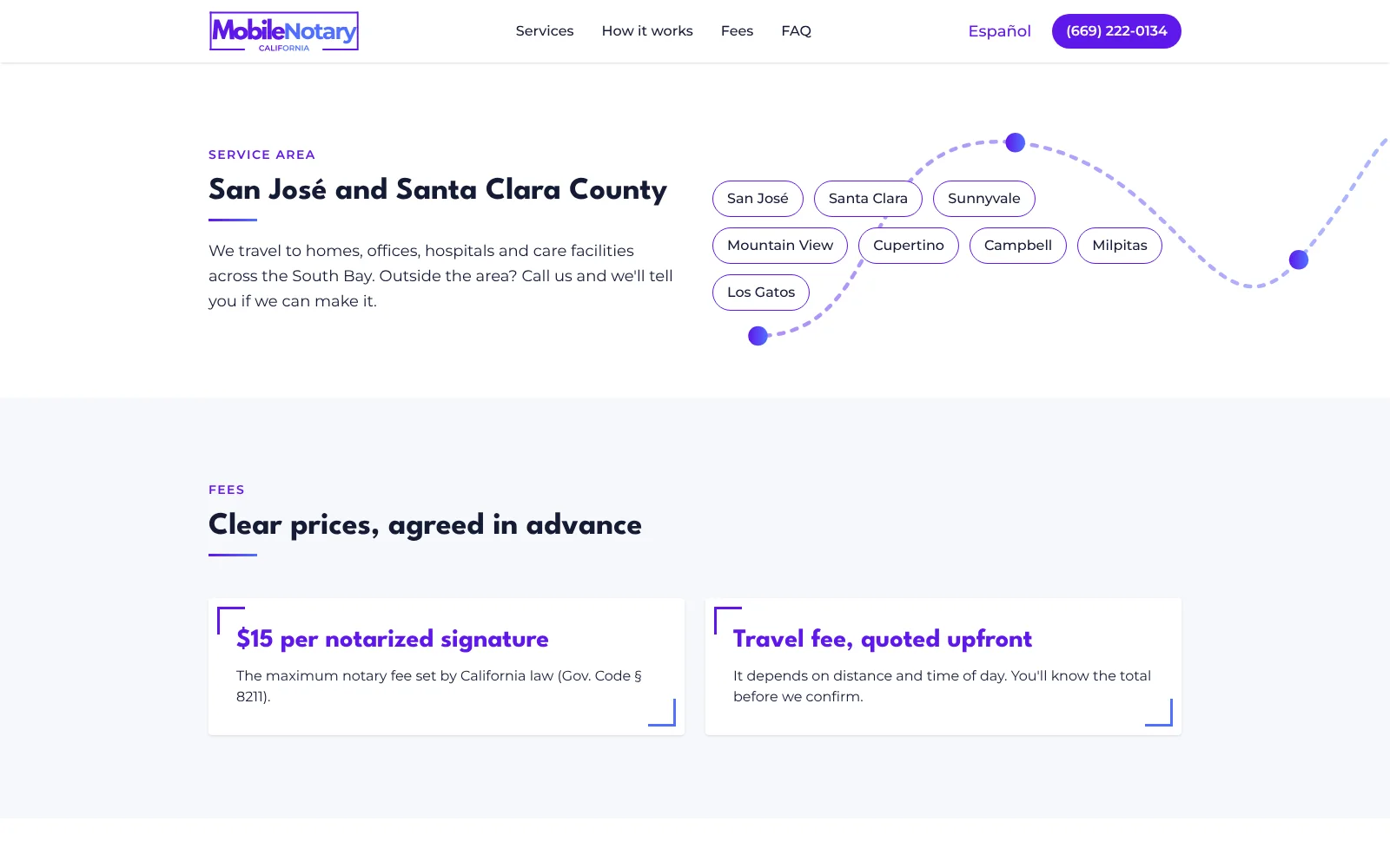
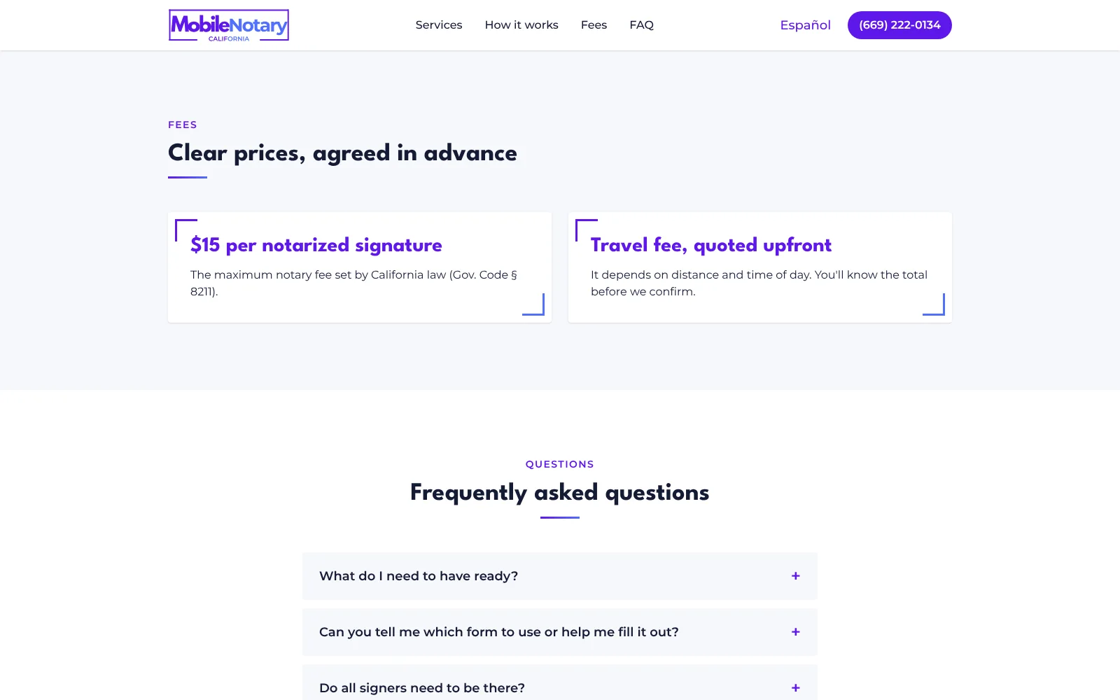
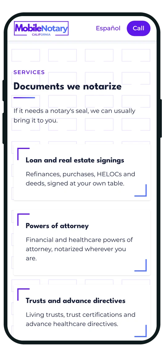
We started with the idea: an open frame, formal and orderly like a document, with a gap in its base because this service leaves the office to come to you. The logo, the manual and every piece came out of it —the SUV, the polo, the card, the stationery— so they read as one company even when different suppliers produce them. Then, to be found: a website with its own hosting and email, built so that someone searching for a notary in their area sees which documents are covered, when, and how to call, plus its search visibility.
The result
A notary you recognise before they arrive. The SUV puts the phone number on every street where it stops, the card and letterhead say the same as the website, and the message —clear, precise and approachable— sounds the same everywhere because the manual writes it down. And whoever lands on the site sees on the home page what the service promises: a document that gets signed and notarized without leaving home.
The brand manual
The manual gathers the rules so Mobile Notary's image is the same on a card, on the SUV or on a screen, whoever produces it.
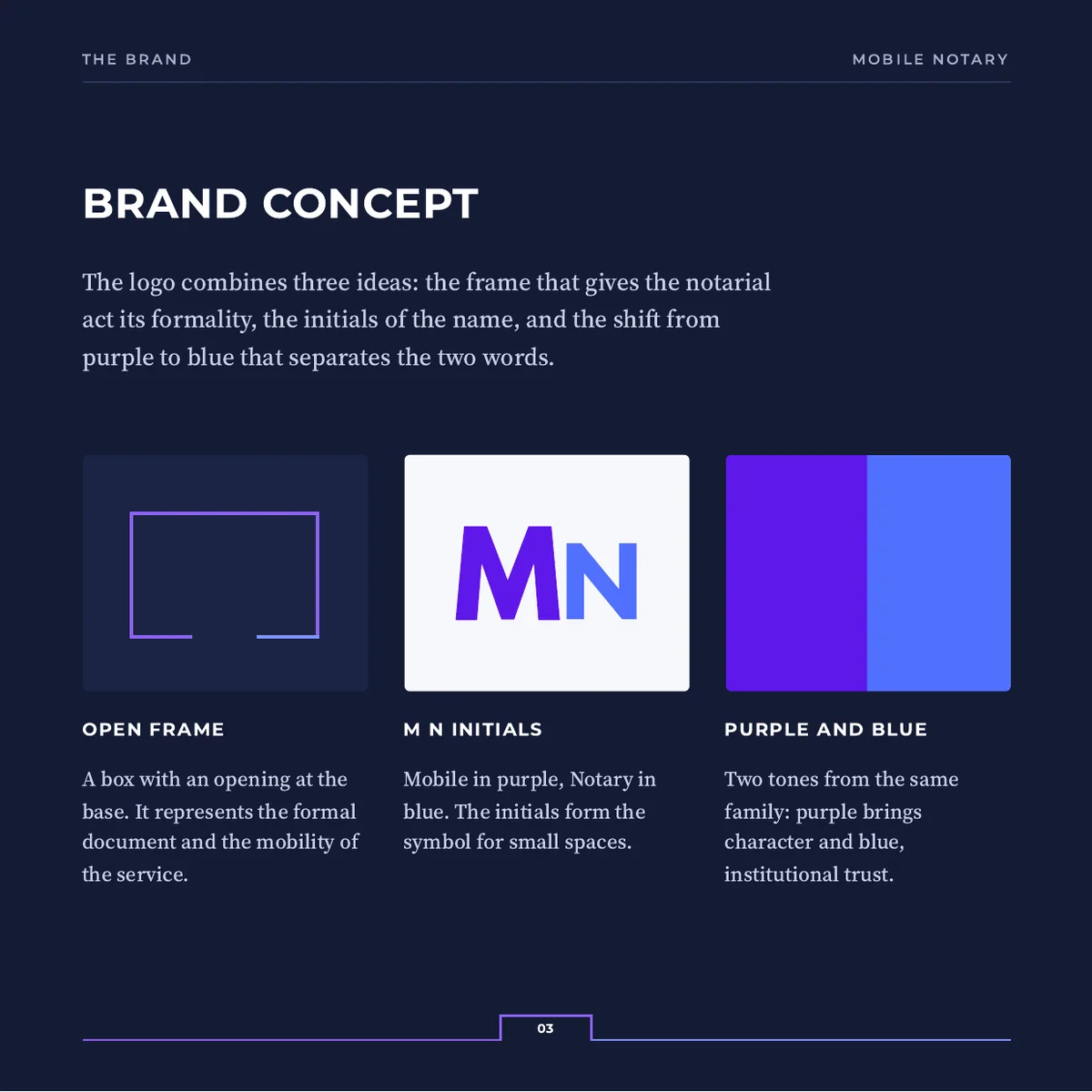
A frame with a way out
The box gives the notarial act its formality and the gap in its base says the service moves. The initials M and N make the icon for small spaces.
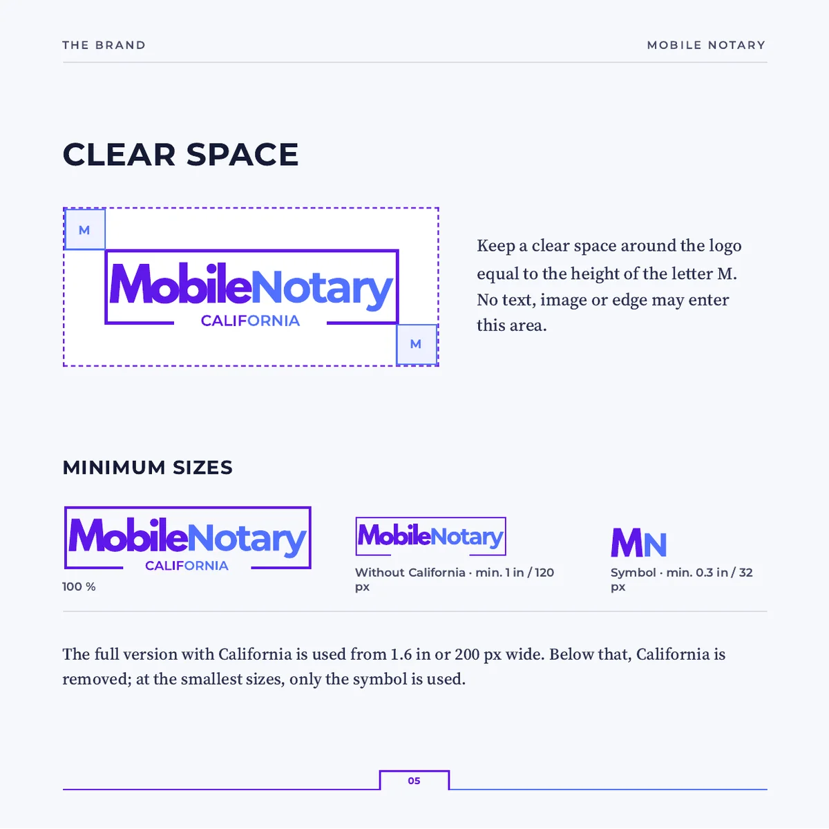
Space around it and minimum sizes
The clear space is measured with the letter M itself, so it comes out the same on a card and on the car door. When the logo gets too small it drops “California” and then falls back to the icon.
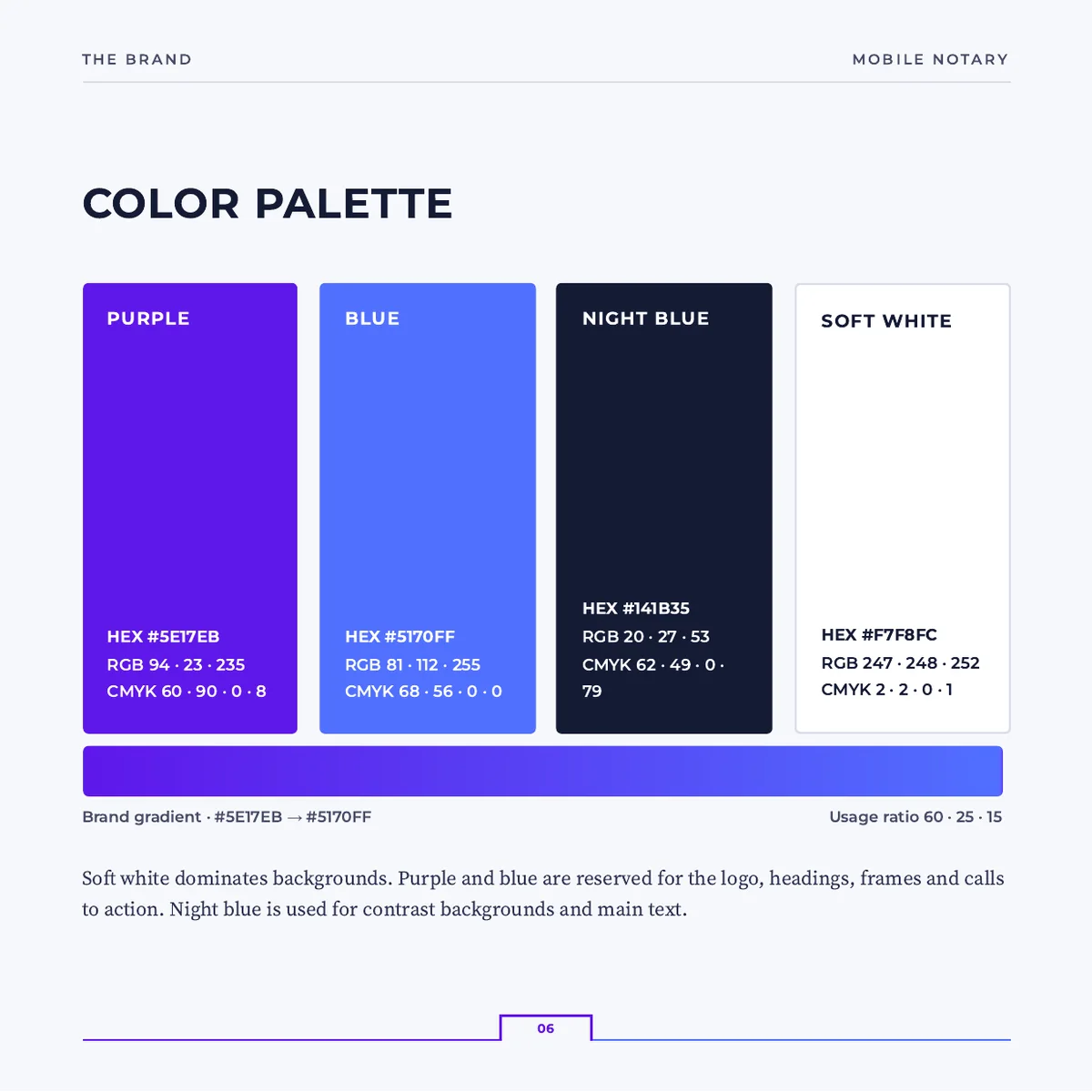
Purple for character, blue for trust
Four colors with their HEX, RGB and CMYK so the printer and the screen reach the same shade. The proportion is fixed, so no piece ends up looking like another company's.
Resources that grow out of the frame
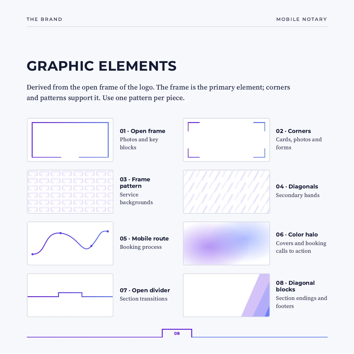
Corners, patterns, diagonals and halos derived from the open frame. With them you can build a sheet, a card or a section of the site without it looking like another brand's.
A version for every background
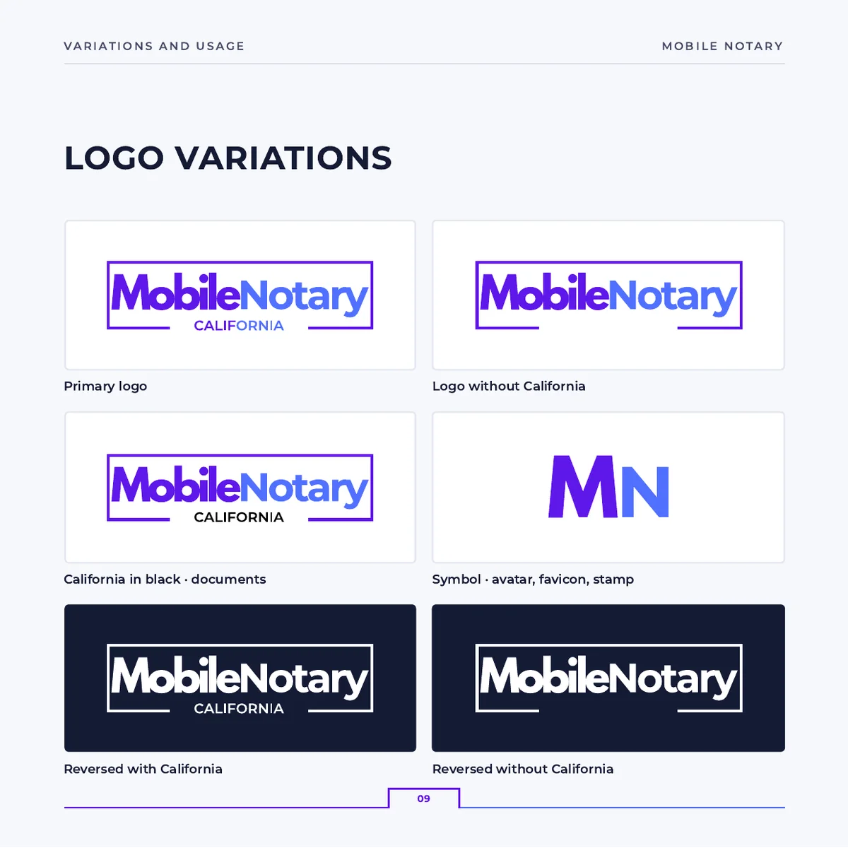
In color, in black, in white and without “California”, each with its own use. Nobody has to improvise the day the logo lands on a dark background.
What not to do, drawn out
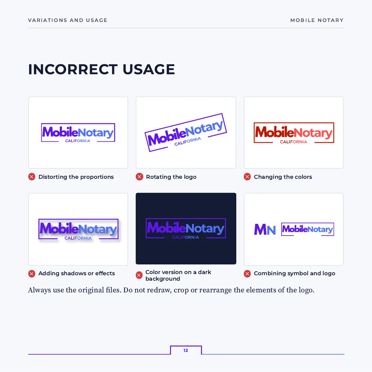
Six mistakes drawn out: stretching, rotating, changing the colors, adding shadows. Drawn rather than described, because that way they're spotted at a glance in a printer's proof.
A clear, precise, approachable voice
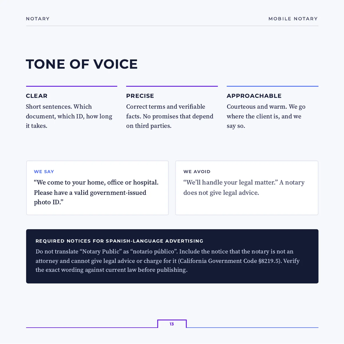
Short sentences, verifiable facts and a friendly tone, with examples of what to say and what to avoid. That way the client hears the same thing in an email, on the site and at their front door.
The project in pictures
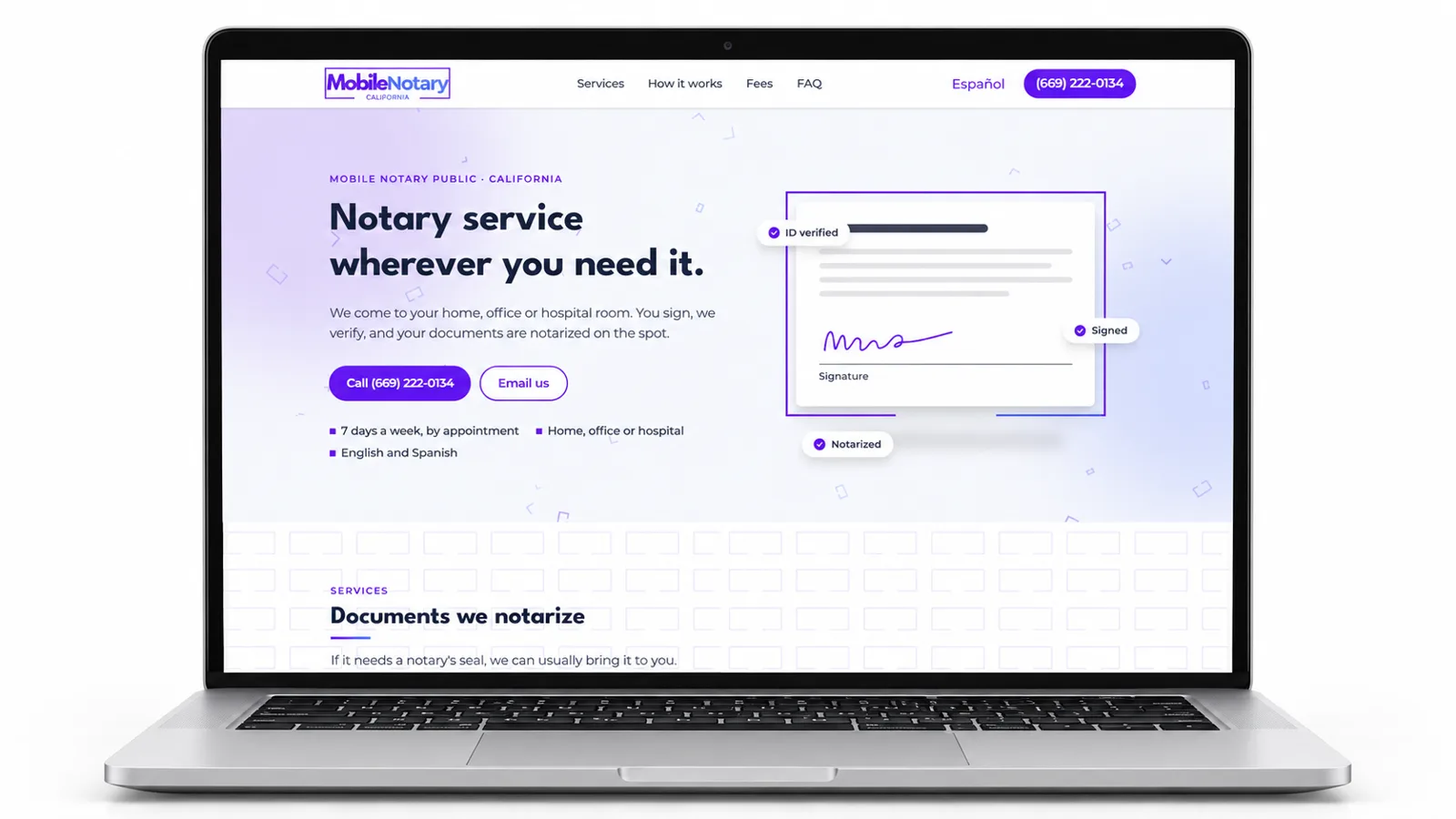


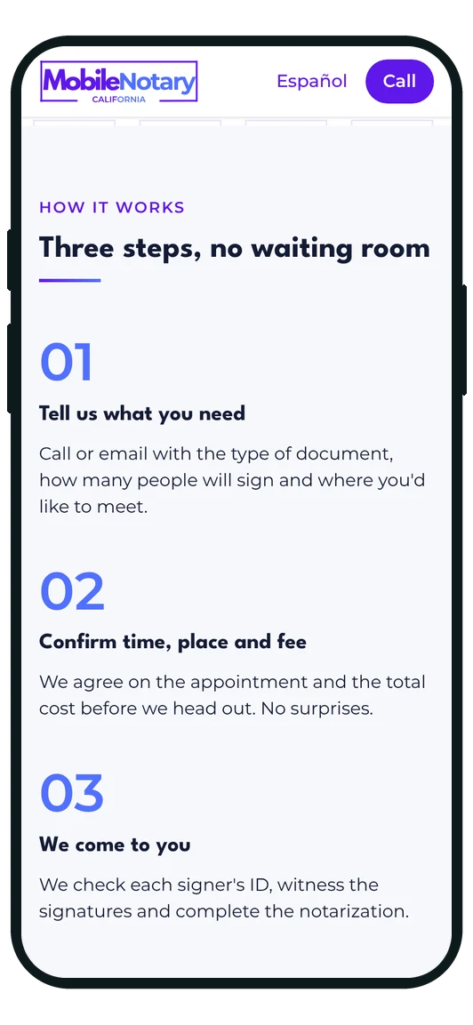
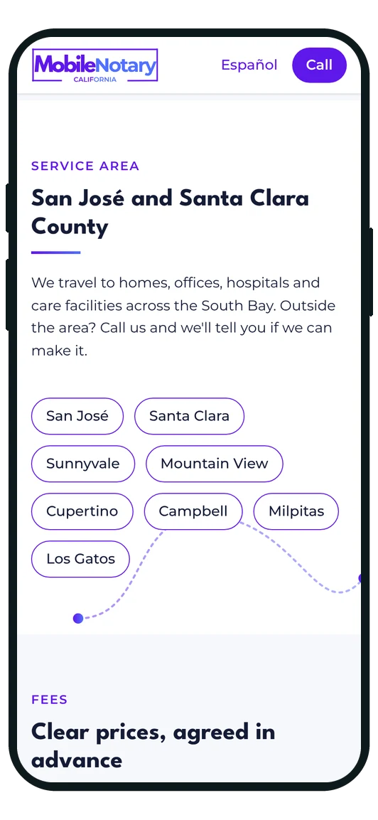
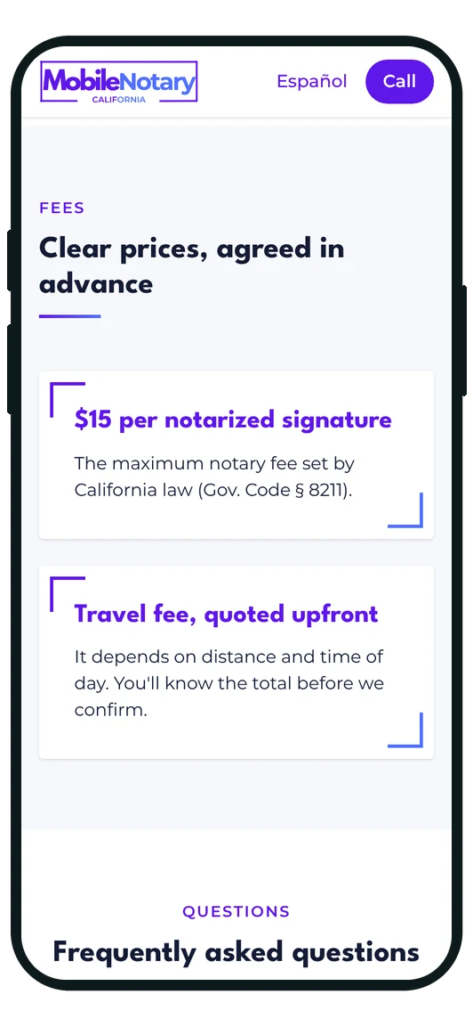
The site, screen by screen
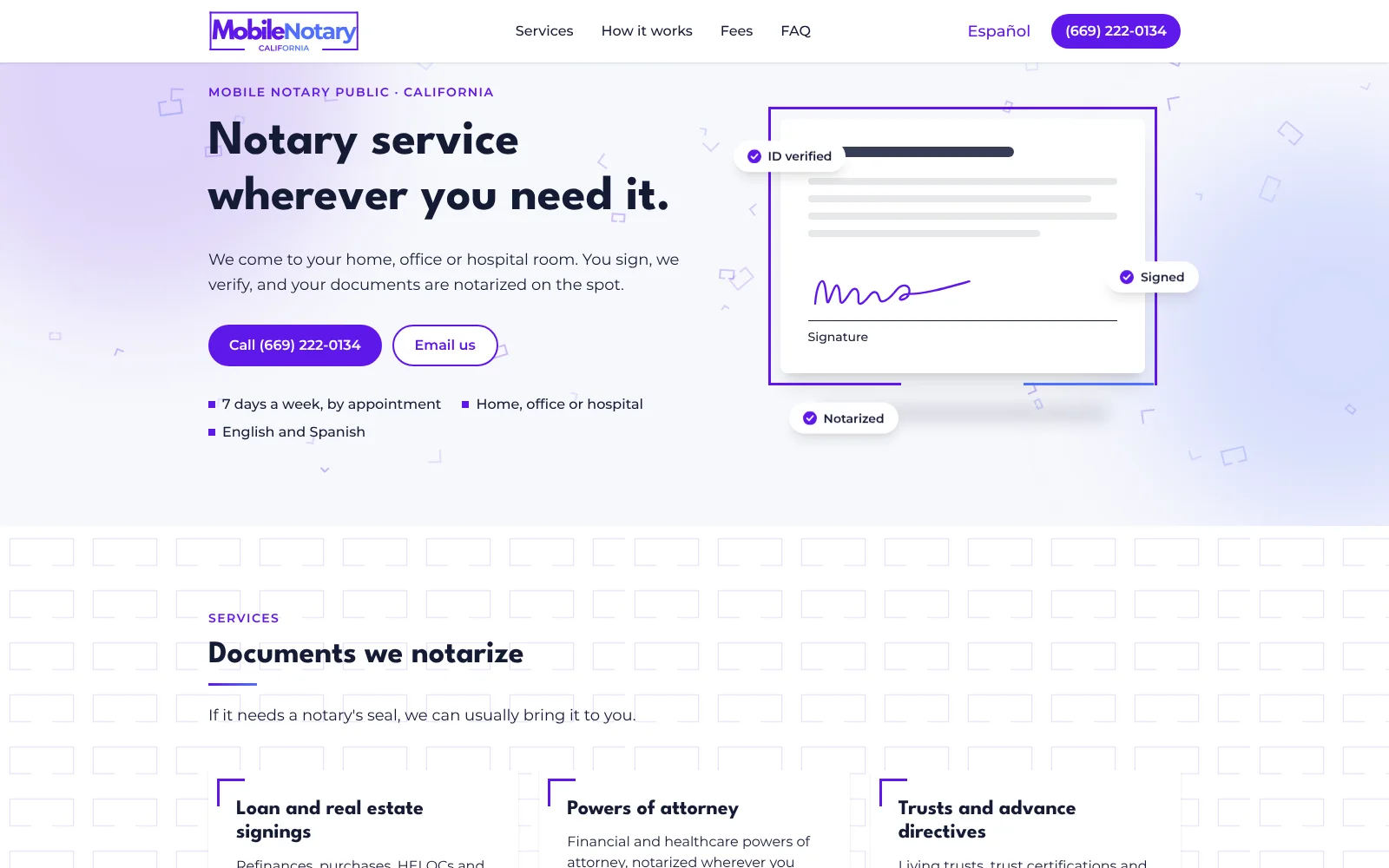
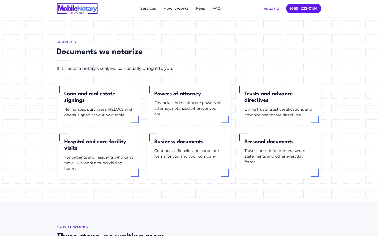
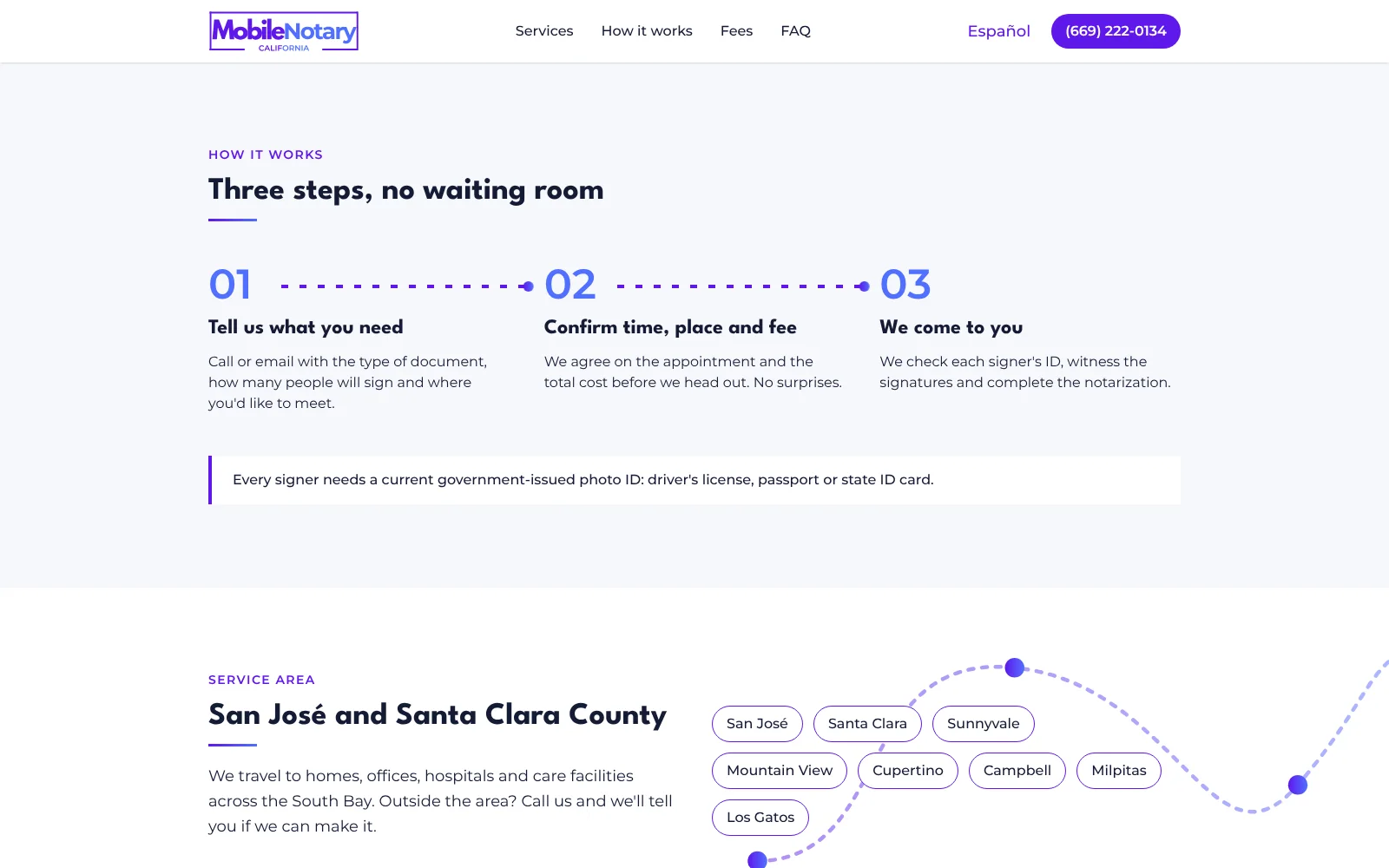
The same site on a phone

Ready to start?
Tell us your idea and we'll show you how to make it a real company.
Let's talk about your project